7 Best Fintech Landing Page Examples

Photo by Pankaj Patel on Unsplash
Think of the last time you landed on a website that just...worked. The flow was seamless. The design, intuitive. Within seconds, you grasped the value proposition. And taking the next step felt like the only logical choice.
When it comes to fintech, nailing this experience is critical. New startups launch daily in this hyper-competitive space. For them and established players alike, standing out with stellar landing pages that convert is an imperative.
But what defines an effective fintech landing page that actually converts visitors into engaged customers? While there are plenty of ways to build a landing page, there’s key ingredients that the best fintech sites use to transform impressions into action. In this article, we'll break down the essential elements for high-impact fintech landing pages.
Looking at 7 real-world examples, we’ll analyze exactly what works and why—from clean design to value messaging to calls-to-action. And when you’re ready to implement these methods into your own Fintech website, Caffeine Marketing is here to help you make it a reality.
What Makes a High-Converting Fintech Landing Page?
In the fast-paced world of fintech, standing out with a stellar landing page is critical for converting visitors into leads and customers. But what exactly makes an effective fintech landing page that drives conversions?
Psychologically, high-performing fintech landing pages tap into core human motivations. They clearly communicate the value proposition within seconds, alleviating visitors' anxiety around understanding the offer. Through clean design, compelling visuals and concise copy, they build a sense of trust and credibility. And they provide a clear path for visitors to take action, satisfying their need for direction.
On a practical level, some key ingredients set the top fintech landing pages apart:
A strong headline and subheading that quickly convey what the visitor will get and why it matters. Often posing an intriguing question or promise upfront grabs attention.
Tightly focused copy on the hero section detailing the key benefits visitors will receive. Bullet points highlighting precise offering details cater to short attention spans.
Relevant and vibrant imagery reinforcing what the product/service provides. Charts/graphics demonstrating solutions can prove especially powerful.
Simple, uncluttered layout using white space strategically, so the CTA stands out. Removing site navigation keeps focus on converting.
Prominent, contrasting call-to-action button urging a click. Often tying benefit to action drives clicks eg. "See Your Savings Now"
Incentive copy detailing what the visitor will get for exchanging contact information. An eBook, tip sheet or consultation offer provide further value.
By tapping psychology and best practices, high-impact fintech landing pages turn prospects into leads, users and brand advocates through the connection they forge. Figure out how to implement this recipe across your brand - and you’ll quickly find yourself inundated with quality leads!
Leveraging the Power of Story on Fintech Pages
Humans are wired for story. When done skillfully, storytelling hooks visitor emotion and helps them see themselves as the hero of the tale - increasing likelihood of conversion. Savvy fintech firms employ storytelling elements on their landing pages through the Storybrand framework pioneered by Donald Miller.
Here’s a simplified version of the Storybrand framework:
Hero - The visitor should realize they're the hero of this journey. Copy and visuals position them as taking control of their financial situation upon signup.
Guide - The brand guides visitors by easing their money struggles. Testimonials from those they've assisted previously build trust.
Plan - Concise copy lays out a specific vision of the future where the visitor has achieved financial freedom/growth with the brand's help.
Call to Adventure - After establishing the struggle, a bold CTA urges visitors to take the first step towards a solution, satisfying their want for direction.
By incorporating such storytelling principles - while addressing core human needs and psychology - fintech firms present visitors with an irresistible offer. Site visitors readily assume the hero role once content resonates emotionally and they grasp how the brand can guide them into the financial promised land with their cutting-edge tools, tips or services.
Need help StoryBranding? We can help.
Our team of award-winning StoryBrand marketers is ready to help you exceed your revenue goals.
Here's what to expect:
1 minute: Introductions, pleasantries [something about the weather], etc.
27 minutes: *insights on digital marketing and quick wins to help you accelerate growth*
2 minutes: Defining the next steps
We look forward to talking to you. 👋
Top 7 Fintech Landing Page Examples

landing page capture from Pipe
At first glance, Pipe's landing page stands out for its vibrant blue backdrop contrasting crisp, white text - instantly establishing the bold fintech brand. Yet vibrant imagery balanced against ample whitespace creates an uncluttered elegance befitting Pipe’s positioning as a premium capital access portal.
The page taps psychology with hero-focused copy, placing site visitors in the driver's seat to "unlock capital on your terms" while a guide-like interface promises to eliminate financing friction. Further elements foster connection and trust:
User-centric imagery - Lifestyle photos personalized with a smiling person and a dog at home. Many feature the laptop or phone interface demonstrating Pipe's ease-of-use.
Quick clarity on the value proposition - Tightly written copy quickly communicates how Pipe furnishes fast access to funds by allowing businesses to "turn future revenues into cash."
Prominent partner logos - High profile partner names like HubSpot build immediate credibility given their market prominence.
While Pipe's landing page features many current fintech best practices, their user navigation truly stands apart as intuitive. Options are presented clearly for "Entrepreneurs" and "Partners" so visitors can self-direct to relevant content quickly. And calls-to-action urge seamless connectivity, promising capital upon click rather than eventual access after lengthy sign-up.
2. Compound

landing page capture from Compound
Compound makes a solid first impression with a clean website interface prominently featuring its logo - establishing the brand instantly. Crisp black headlines pop on a bright white/cream background, with bold typography that's professional yet approachable - much like the tailored financial advisors Compound promises to connect visitors with. Remember - the landing page should tell a story!
The site employs key elements to convey Compound's positioning as wealth management tailored to the modern world:
Targeted audience messaging - Copy speaks directly to customer subgroups like "Founders" and "Families", guiding visitors to self-identify and feel understood.
Relatable imagery - Candid photos featuring real clients project the services as inclusive and accessible across demographics.
Prominent social proof - High profile publications like Forbes and Barron's logos build immediate credibility.
Standout CTAs - Action-driven buttons urging visitors to "Talk to an advisor" or "Try the dashboard" provide clear pathways for engagement.
While many fintechs chase the same millennial dollar, Compound sets themselves apart by making wealth management seamless for multiple generations. The site conveys their modern approach through a clean interface with no barriers to entry - as evident by CTA copy promising users can bypass paperwork and directly access advisor matching or portfolio dashboards upon click.
3. Kikin

landing page capture from Kikin
Kikin makes a distinctly vibrant first impression for a fintech firm, with earthy greens and natural wood textures befitting their eco-conscious mission. Typography as nourishing as the landscapes pictured, urges visitors to "Finance the Future" with invoice factoring free of equity sacrifice.
While many landing pages overlook aesthetics for function, Kikin strikes an artful balance using design to reinforce their values. Key elements include:
Evocative thematic color scheme - Soothing green hues echo the tranquil meadows pictured, underscoring Kikin’s commitment to environmental ethics.
Illustrative scenery - Scenes resonate with the great outdoors and visions of a brighter future for the planet through ethical business.
Messaging aligning design with purpose - The call to "Finance the Future" paired with idyllic settings suggest Kikin fuels both revenue growth and sustainability.
These touches work synergistically to form deeper emotional connections, promising services attuned to the future of both entrepreneurial dreams and global wellbeing. While details on Kikin’s fintech elements may seem to live secondary to the feel-good imagery, the "Get Funding" CTA provides a gateway to functionality - beckoning businesses towards a model that doesn’t sacrifice finances or values.
4. Tandym
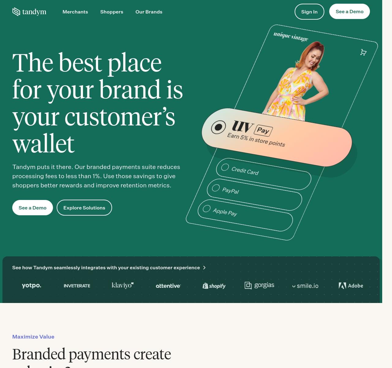
landing page capture from Tandym
Tandym makes a vibrant first impression with their deep green backdrop - suggesting prosperity and seamless financial transactions. Prominent headline copy quickly establishes their value proposition: enabling brands to tap directly into consumer wallets by becoming the card itself. Supplementary imagery resonates by featuring a stylized female shopper on an app-like interface - a warm grin implying rewarding loyalty through Tandym.
The site employs key strategies to convey Tandym’s positioning as the fintech portal between customer and brand:
Evocative headline takes certain stage - The opening hook “The best place for your brand is your customer’s wallet” forefronts the deep customer intimacy Tandym’s suite strives for.
Seamless platform integration highlighted - Listing major eCommerce/CRM systems conveys unified incorporation into existing tech stacks.
Lean messaging on the page - Concise explanations communicate Tandym’s providing sub-1% processing fees to furnish savings for heightened shopper rewards/retention.
Prominent CTAs - Action-driven buttons to “See a Demo” and “Explore Solutions” provide clear pathways deeper into sales funnels.
While Tandym reveals few details about its payment functionalities upfront, its effective blending of emotive loyalty propositions alongside financial efficiency promises compels further clicks. The site successfully associates economic and emotional resonances to foster brand-consumer bonds - converting casual visitors into enraptured subscribers with benefits for both parties.
5. Increase

landing page capture from Increase
Increase makes a polished first impression fitting of its positioning as an elite financial API platform. Crisp whitespace surrounds core elements like the prominent blue header housing its bold product tagline: “Enterprise-Grade Banking APIs”. The descriptive tech headline paired with geometric graphics and coding snippets convey sophistication beyond most fintechs.
The site employs key strategies to reinforce Increase’s market presence as a seamless banking integrator for platforms worldwide:
Purposeful color palette - Cool blue tones traditionally signal trust and security for financial transactions, which Increase promises in spades.
Savvy tech messaging - Concise copy communicates specialized offerings like “Virtual IBANs” and “Automated reconciliation” for developers.
Relevant imagery - Abstract polygons nod to precision and innovation in API architecture behind banking processes.
Potent social proof - High profile clients like Ramp and Gusto establish credibility in the platform’s ability to power fintech giants.
While Increase's landing page doesn't give a ton of insight into their financial products, its modern design allows the polish to speak volumes. By balancing aesthetics with functionality, Increase manages to stimulate and satisfy at once - converting developers drawn to well-coded solutions for banking bottlenecks.
6. Titan
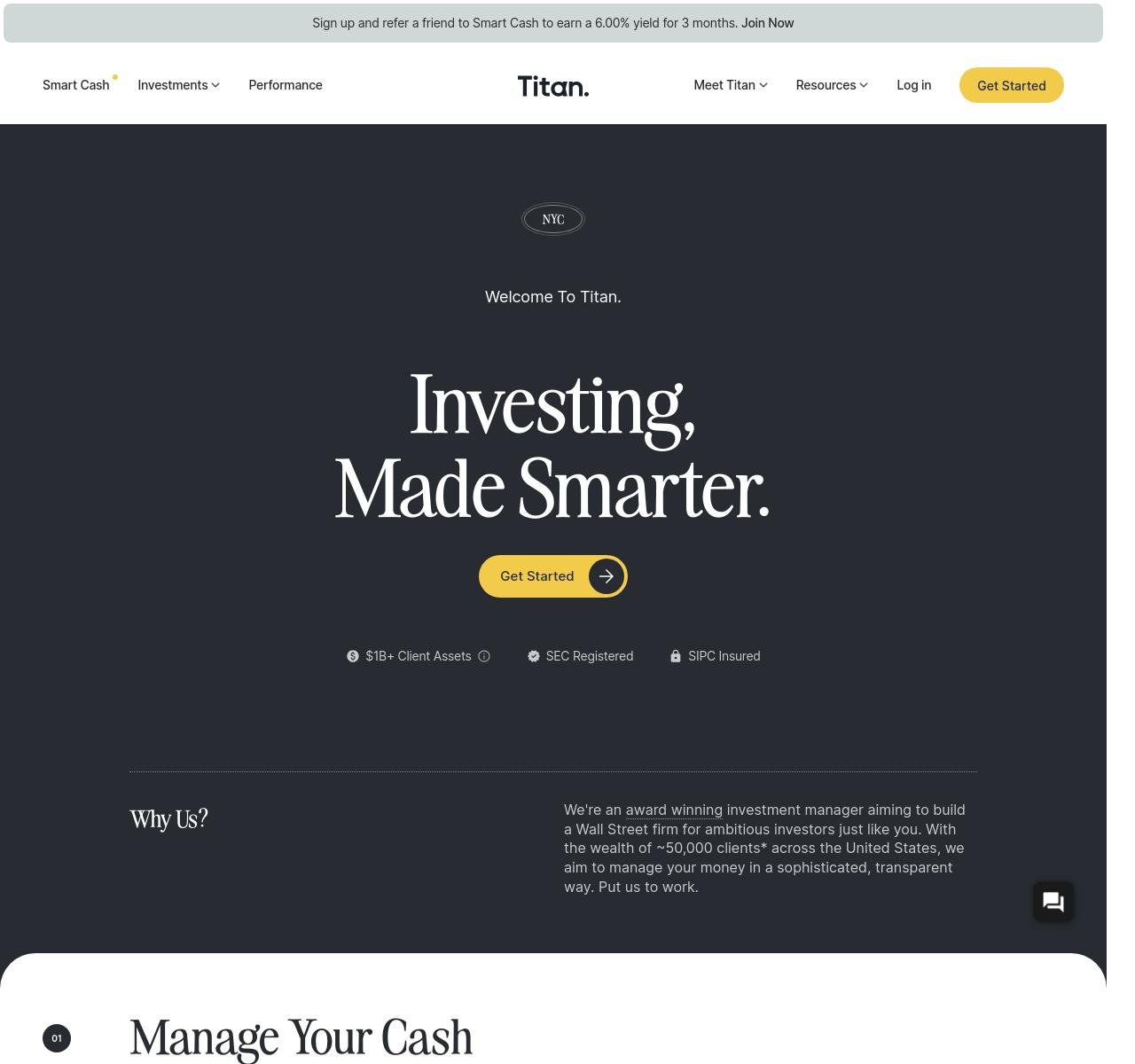
landing page capture from Titan
We love Titan’s fintech landing page for it’s professional-feeling dark backdrop and metallic gold accents - reflective of the elite investments it offers. Top-line messaging packs a one-two punch, establishing its value prop: “Investing, made smarter” - implying AI-driven intelligence tailored to the user.
The site further drives Titan’s positioning as the portal to sophisticated wealth management for millennial horizons and sensibilities through:
Polished, premium landing page design - A monochromatic scheme conveys stability and primes perceptions of exclusivity.
Quantified credibility - Prominent display of “$1B+ in Client Assets” provides social proof of scale and experience.
Clear-cut navigation - Top menu offers straightforward options easing access to offerings, account access, and knowledge base.
Targeted content - The homepage copy explains smart guidance on assets aligned to younger investors’ interests like crypto.
Prominent security touchpoints - Trust logos for SEC/SIPC establish Titan’s security measures upfront.
While the About and Team pages reveal more on Titan’s backers, the sleek landing page provides just enough on offerings for the target demographic. Its design sophistication implies elevated status - yet approachable menus welcome new visitors to wealth services crafted for their digital-first mentalities. The crafted balance between exclusive and accessible converts aspirational signups.
7. Atlas

landing page capture from Atlas
The Atlas fintech landing page makes a soft statement with a pastel backdrop and artistic lighting, setting an ambient scene befitting the premium debit card took center stage. Top-line messaging leads with the bold header “No Limits” - encapsulating the card’s promise of barrier-free access to exclusive lifestyle events and services.
The site employs key strategies to convey Atlas’ positioning as one’s passport to luxury living:
Refined minimalist aesthetic - Plenty of whitespace directs focus towards the metallic card and its array of privileges.
Tactile card display - A close-up showcasing sleek metal composition and custom design aesthetic primes perceptions of tangible quality.
Narrative-driven copy - Describing the card as the insider “friend” who can secure hot nightlife reservations makes Atlas relatable.
Lifestyle-centric messaging - Perks highlighted include special access to sushi classes, concerts, sporting events - catering primely to affluent sensibilities.
While the About page likely lists the team and backers, Atlas’ landing page instead spotlights its most premium offering - the card itself.
By framing functionalities via experiential benefits, Atlas manages to make banking beautiful. Its artistic direction transforms utilitarian monetary services into bespoke currency for the cosmopolitan class - converting signups seeking access to the luxury life.
Let Us Bring Your Landing Page To Life
A stellar fintech landing page balances aesthetics and purpose - converting impressions into action while telling a compelling story. The examples we’ve analyzed demonstrate what best-in-class design paired with strategic copy can unlock - namely, quality leads that convert through the funnel.
Now it's time to make your own fintech brand stand out. Convert visitors into leads, users, brand advocates. See your subscriber base scale as your site resonates on emotional and practical levels.
Caffeine Marketing brings over a decade of specialized expertise perfecting high-performance fintech landing pages. Named a top fintech marcom agency by Clutch, UpCity, EOS, and Manifest, we leverage insight into human psychology with proven digital strategies to create stunning content and design.
Book your free 30-minute consultation today to get insights from award-winning fintech marketers - including quick wins to accelerate growth. There's no obligation beyond sparking a game-changing conversation just one meeting away.