
Are you struggling to convert visitors into qualified leads on your web or mobile app development landing page?
Is your bounce rate climbing while your conversion rate remains frustratingly low?
You're not alone. When potential clients land on your development page, you have only a few seconds to establish credibility, demonstrate technical prowess, and communicate clear value.
You have to do that all while maintaining an experience that reflects the quality of your code. Fail in any of these dimensions, and prospects will leave – fast.
The vast majority of software development prospects make initial judgments about your company's capabilities based solely on your landing page experience.
That's right - before they've seen a single line of your code or spoken to any of your developers, they've already formed a lasting impression of your technical competence.
To stand out from the competition, you need to demonstrate credibility, showcase your technical prowess, and communicate clear value - all in a way that resonates with potential clients.
Let’s take a look at the top web and mobile development companies and see how they use their landing pages to effectively convey their capabilities and attract leads.
{{book-a-call="/cta"}}
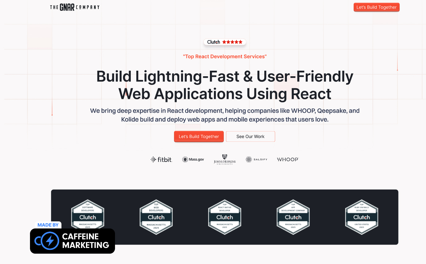
The Gnar's development landing page breaks industry conventions with a vibrant, personality-filled design that immediately communicates their unique approach to software development.
Their conversational headline "We build custom software that humans love to use" establishes both technical credibility and user-centric philosophy in a single sentence, while their project showcase features actual application interfaces rather than generic mockups.
The page's design strikes a perfect balance between technical credibility and accessible messaging, using a clean grid-based layout that subtly reinforces their development expertise while making complex offerings easy to understand.
They place powerful client testimonials at the top, followed by case studies of recognizable organizations like AARP Foundation that showcase measurable results (40% fewer clicks) - exactly what buyers need to see from a development partner.
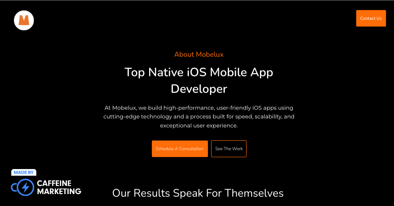
Mobelux's landing page demonstrates minimalist power by strategically using negative space and high-contrast colors. Their iOS development messaging cuts through complexity by focusing on measurable outcomes (200% increase in monthly users) rather than technical specifications.
This approach creates immediate relevance for both technical teams and business stakeholders evaluating mobile development solutions. Their process visualization breaks complex development into clear steps that potential clients can easily understand and visualize.
Mobelux balances technical achievements with business outcomes through carefully selected metrics and case studies that speak to both technical evaluators and decision-makers. Their industry-specific targeting allows different technical verticals to find relevant information fast.

Tapcart's landing page excels in mobile commerce app development with its use of high-quality images, auto-play videos, and GIFs showcasing the app in action. This visual-first method highlights the product's capabilities clearly.
The page's effectiveness lies in balancing visual appeal with conversion. Strategically placed CTAs foster engagement without being pushy, while concise copy makes the value proposition clear for both technical and business stakeholders.

Spendee App's landing page balances visual impact and concise messaging with a two-tone layout and large, colorful screenshots. This visual-first strategy showcases the app's interface and functionality, helping visitors quickly grasp its offerings.
This trust-building approach appeals to both rational buyers seeking evidence and emotional ones attracted to user stories. The landing page effectively guides visitors through the app's value proposition in a few clear steps, minimizing confusion while maintaining essential details.

Keeply's landing page exemplifies minimalist design with its elegant single-column layout and changing background colors that define sections. This creates visual interest and clear separation without complex elements or distracting animations.
Its effective typography, space use, custom fonts, and a balanced text-to-image ratio enhance readability while appealing to design-conscious and security-focused audiences.

Muzzle's landing page breaks conventional wisdom with its remarkably concise, above-the-fold design that requires absolutely no scrolling.
The page uses humor and real-life examples to instantly communicate the app's value proposition - preventing embarrassing notifications during screen sharing - without requiring lengthy explanations or feature lists. This approach creates an immediate "aha moment" that resonates with anyone who's experienced the problem the app solves.

Aaptiv's fitness app landing page builds credibility through testimonials, side-by-side screenshots, and logos from major partners.
This social proof addresses various trust factors - user experiences, interface quality, and industry validation - showcasing the app's value. The page uses concise, benefit-driven messaging instead of technical jargon or marketing hype, connecting with fitness enthusiasts of all skill levels.

Headspace's meditation app landing page demonstrates the power of conversion focus through its single, prominent CTA that combines free trial access and app download. This streamlined approach eliminates decision fatigue and creates a clear, frictionless path to conversion for visitors at any stage of awareness.
We love its uncluttered, focused design that reflects the app's core promise of simplicity and clarity. By eliminating unnecessary distractions and focusing entirely on user action, the page creates an experience that aligns perfectly with the product's purpose.

Canva's design platform landing page exemplifies conversion optimization through its perfect 1:1 attention ratio - every single link on the page supports the primary conversion goal rather than creating potential exit points. This minimalist approach creates a clean, streamlined experience that speaks to both creative professionals and business users seeking efficiency.

Cameo's landing page approach eliminates confusion for first-time visitors and creates an immediate understanding of the value proposition.
The page leverages animated samples and lively use-case examples to showcase the product in action, allowing visitors to experience the emotional impact of receiving a personalized message without requiring extensive explanation.
This show-don't-tell approach fosters an immediate emotional connection that text alone jusst can’t achieve.

Duolingo's language learning app landing page demonstrates the power of conversion focus through its singular, prominent CTA - "Get Started" - that creates a clear path to action without competing options.
The page combines visually appealing design with concise, benefit-focused information that quickly communicates the app's value proposition without overwhelming visitors. Plus, interactive elements create immediate understanding of the app's gamified learning approach without requiring lengthy explanation.

Vercel's landing page opens with a precise value proposition that communicates comprehensive capability without exaggeration.
This outcome-focused approach establishes their purpose-driven stance in the development platform space. The page segments visitors by use-case with tidy navigation cards, shortening the buyer journey and allowing different technical personas to quickly find relevant information.

Linear's landing page exemplifies minimalist power through spare design paired with conversational headline copy and subtle motion that shows their tool in action.
The page creates immediate engagement through its clean design and thoughtful animations that demonstrate the product without overwhelming the visitor. The minimalist, focused approach of the landing page directly reflects the product's core promise of streamlined, efficient project management.

Supabase's landing page creates visual interest while clearly communicating their value proposition of speed combined with scalability.
Their open-source credentials are prominently displayed, establishing immediate credibility with technical audiences who value transparency and community-driven development. This strategic positioning creates instant alignment with developer values while differentiating from proprietary alternatives.

Replit's landing page creates immediate engagement by dropping an AI coding demo right in the hero section, allowing prospects to experience value before signup.
The interactive element allows developers to immediately understand the value proposition through hands-on experience rather than marketing claims. This approach is particularly effective for development tools where seeing is believing - creating instant credibility.
The best web and mobile app development landing pages establish technical authority without drowning visitors in jargon:
This balanced approach ensures CTOs see the technical excellence they require while business stakeholders understand the practical implications without feeling alienated.
Generic claims about "innovative solutions" or "cutting-edge technology" fail to connect with today's savvy buyers. The most effective development landing pages in 2025 prioritize concrete business outcomes.
By focusing on business results rather than technical processes, landing pages create immediate relevance that purely technical messaging simply cannot achieve.
The most compelling web and mobile app development landing pages don't just talk about their capabilities - they demonstrate them through their own implementation:
These elements communicate volumes to development-savvy prospects who often evaluate these technical details before engaging.
Software development involves significant investment and risk. The best landing pages address these concerns through strategic trust signals:
These trust elements address the fundamental question every visitor has: "Can I trust you with my critical development needs?"
At Caffeine Marketing, we've helped tons of web and mobile app development companies transform their landing pages from generic tech brochures into powerful lead-generating assets.
Our approach combines technical expertise with conversion-focused design to create landing pages that don't just look impressive - they drive measurable business results.
Ready to see how your development landing page stacks up against these industry leaders? Book a free 30-minute consultation with our team today. We'll analyze our current performance and come up with actionable ideas you can put to use right now. Let’s chat!
{{book-a-call="/cta"}}
An effective web and mobile app development landing page should include visual demonstrations of capabilities, outcome-focused messaging, a clear methodology explanation, proof elements like case studies, multiple conversion paths for different stages, and flawless technical implementation that showcases your quality standards.
Design goes beyond aesthetics; it reflects your attention to detail and user experience. Testing reveals that well-designed interfaces - featuring clear information hierarchy, adequate white space, and subtle interactive elements - can boost visitor trust by up to 48% and conversion rates by 32% compared to generic templates.
The most effective approach is a balanced "capability-outcome framework" linking technical capabilities to specific business benefits. Establish technical credibility to pass the expertise filter, then translate that capability into business language addressing stakeholder concerns. This dual-language approach satisfies both evaluators and decision-makers without alienating either group.
High-converting development landing pages feature CTAs for every stage of the buyer journey. From low-commitment options like code samples to bookings and estimate requests for decision-ready visitors, each CTA should add value and move the relationship forward.
