So, you and your team are hard at work building excellent software products – and you’ve got the skills that many in the market are dying to hire.
But can paying clients even find you online? If your website doesn't effectively communicate your expertise and value, those leads are heading straight to your competitors.
At Caffeine Marketing, we know this disconnect: you're exceptional at creating software solutions, but generating qualified leads through your website? That's a different kind of challenge.
Your software development website isn't just a digital portfolio—it's your most powerful sales tool, credibility builder, and lead generation machine all rolled into one. But too often, we see brilliant development teams struggling with websites that fail to convert visitors into leads, with design that alienates non-technical decision-makers.
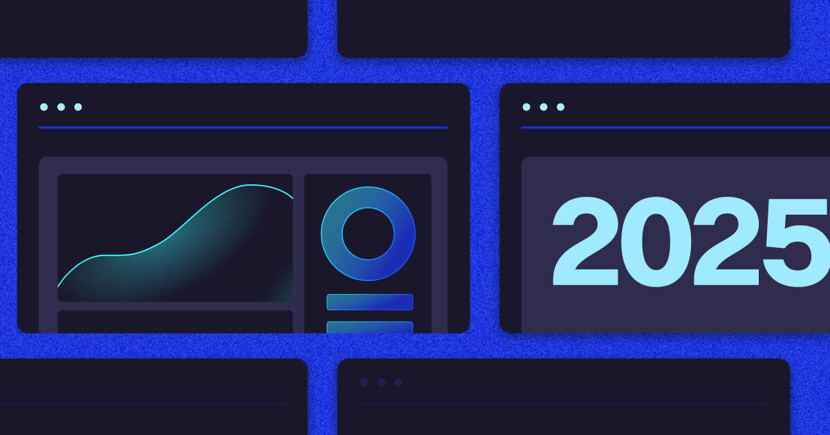
As we move deeper into 2025, client expectations are only growing. They want experts who know their stuff and are willing to show it. Features like AI-powered content personalization, interactive code demonstrations, and visualizations are now standard rather than exceptional.
So, is your software development website keeping pace or falling behind?
We've analyzed some of the best software development websites and compiled this list of the 16 best examples in 2025. These sites don't just showcase technical prowess but actually drive conversions and business growth.
Site Designed by Caffeine Marketing
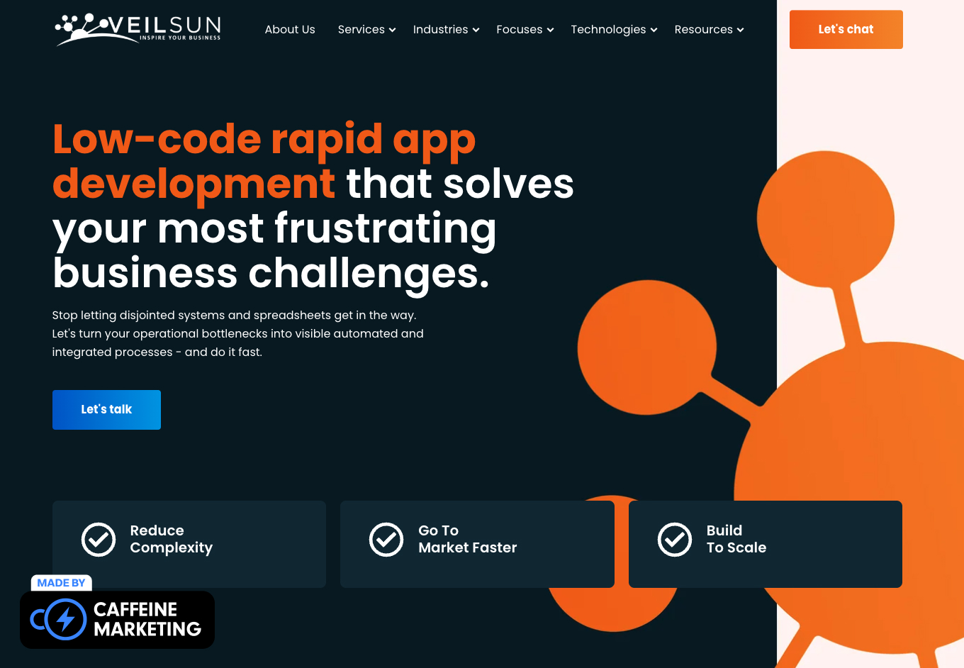
We love VeilSun's website because it gives potential clients exactly what they're looking for: clear solutions wrapped in compelling social proof.
The homepage immediately establishes credibility with eye-catching metrics highlighted in orange that create visual anchors that draw attention to their impressive accomplishments and naturally pull visitors down the page to learn more.
VeilSun's site is particularly effective for lead generation because it humanizes its technical software services through authentic client testimonials featuring real names, photos, and companies. This builds trust in an industry where many competitors hide behind vague claims and stock photos.
Their value proposition is refreshingly straightforward, and the three-point benefit structure (Reduce Complexity, Go To Market Faster, Build To Scale) creates a clear, scannable message that resonates with busy decision-makers who don't have time to decipher technical jargon.
Why We Love It:
Site Designed by Caffeine Marketing
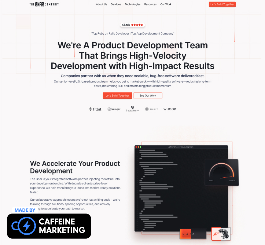
The Gnar's website achieves something rare in software development—it's actually fun. The site perfectly balances their team's technical expertise with a sense of approachability through a clean, minimalist design that lets their work and results speak for themselves.
The Gnar uses their site as both a "Who We Are" statement and a "What We Do" showcase. The smooth and clean card-based layout allows visitors to browse project examples – making it easy to understand their capabilities without overwhelming technical stuff.
What really sets their lead generation approach apart is the interactive problem-solver section, "What's Your Gnarly Problem?" This feature personalizes the experience based on the visitor's role and challenges, creating an immediate connection and guiding them toward relevant solutions. It hooks potential clients quickly and makes the process feel custom-tailored to their needs.
Why We Love It:
Site Designed by Caffeine Marketing
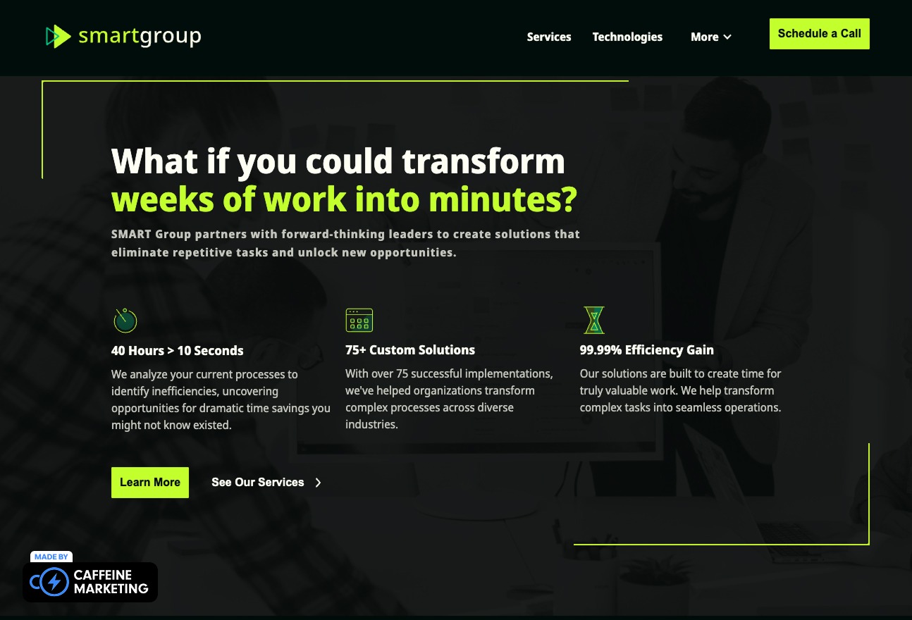
SMART Group's website proves that simple can be powerful in software development marketing. Their striking black background with vibrant neon green accents pairs perfectly with their bold headline, immediately communicating their value proposition.
This site is a lead generation powerhouse because they back up their claims with specific, compelling metrics that create immediate interest while establishing credibility. The clean, minimalist layout ensures that these impressive figures stand out against the dark background, making them impossible to miss.
The site makes conversion pathways crystal clear with three primary navigation options. This kind of strategic simplicity reflects SMART Group's understanding that overwhelmed visitors rarely become leads.
Why We Love It:

CSS Chopper's website immediately impacts with its bold declaration of being "Trusted by Top CTOs," establishing credibility for technical decision-makers.
Their homepage creates visual interest through a grid of actual client faces alongside a prominent video play button—a smart conversion strategy that humanizes their development team and builds trust through transparency.
The site's clean green and white palette creates a professional yet approachable feel, and we love that they focus on business outcomes rather than technical specifications. For example, "Supercharge your business growth with modern technology" speaks directly to the ROI concerns of potential clients.
Why We Love It:
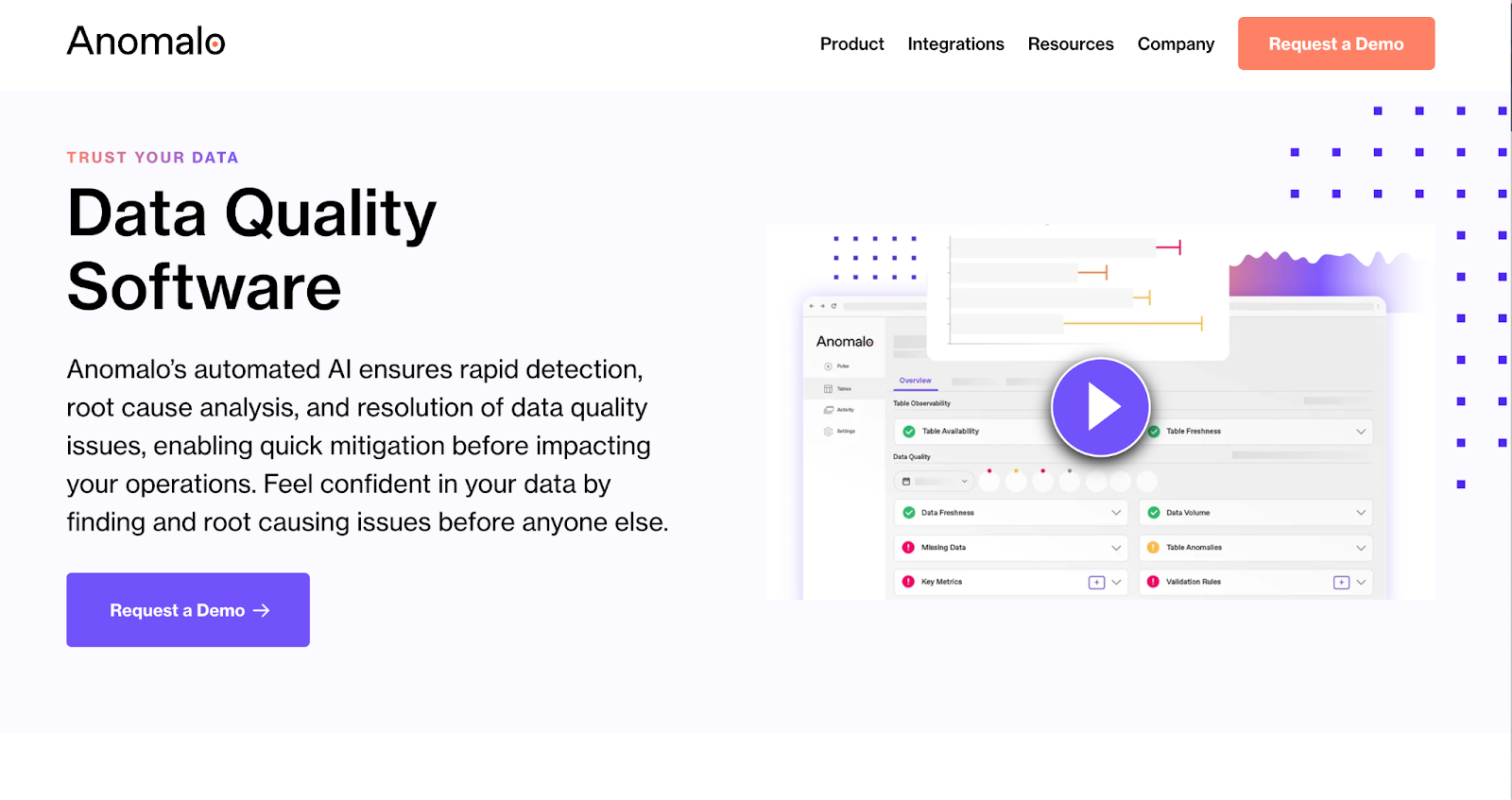
Anomalo's website demonstrates how to transform complex technical capabilities into clear business value. Their clean, light design with strategic purple accents creates a sense of trust and reliability and showcases their product with an actual interface screenshot – we love that.
Their subheading quickly explains the platform's core value, balancing technical description with business outcomes.
Why We Love It:

Stacklet has a striking dark interface that visually communicates the complexity of cloud infrastructure while maintaining clean, organized design. Their headline uses a nice rhythmic repetition to create a memorable value proposition focused on business outcomes rather than technical capabilities.
What makes this site particularly effective is the specificity of their claims. They provide a concrete, measurable benefit that immediately attracts attention from cost-conscious decision-makers.
Why We Love It:

Imaginary Cloud's website immediately captivates with a serene blue background and bold "BUILD BIGGER" headline. Its minimalist design creates a sense of space and possibility, balancing aspirational messaging with concrete credibility.
And let’s talk about social proof! Their impressive client logo bar featuring major brands like Nokia, Sage, and NEOM anchors the bottom of the screen, instantly establishing trust while not overwhelming the primary message.
Why We Love It:

BairesDev's website takes a refreshingly human approach to software development with its showcase of actual development team members, complete with their specialties and years of experience prominently labeled.
Their content clearly communicates both their value proposition and unique selling point( timezone-aligned developers), which is a key pain point for companies working with offshore teams.
The specific metrics throughout the content provide concrete proof points rather than vague claims and create both social proof and exclusivity.
Why We Love It:

Intellectsoft continues what appears to be a theme in 2025 of dramatic dark visuals of their actual development workspace to create an immediate sense of professionalism and scale.
We particularly like their industry-specific navigation at the bottom of the hero section. The eight distinct industry icons (Fintech, Healthcare, Construction, etc.) provide quick pathways for visitors from different sectors. This segmentation strategy helps potential clients quickly find relevant case studies and solutions for their specific industry.
Why We Love It:

We love Heumor’s playful astronaut figure, which adds some personality to the site while symbolizing exploration and innovation. It’s a clever visual storytelling method that demonstrates their creative approach alongside their messaging.
Their business-focused messaging stands out in an industry where many agencies focus on technical capabilities rather than client results.
Why We Love It:

Goji Labs' website balances technical capability with business outcomes through its subtle gradient background and strategic use of color. The right side of the screen displays actual code, which is always a smart demonstration of technical proficiency. It shows that your software development homepage should appeal to technical stakeholders while staying non-intimidating to business decision-makers.
Why We Love It:

ELEKS takes an innovative approach to industry specialization with their horizontal slide navigation system featuring distinct industry categories.
Their image-driven design focuses on showing rather than telling, with hands collaborating over financial data that immediately communicates their consultative approach. The headline "Deliver industry-leading financial services" speaks directly to outcomes rather than technical capabilities – a clever positioning that appeals to senior decision-makers.
Why We Love It:

Fingent's website uses some dramatic visual presentations that positions them at the cutting edge, while their site copy and design speaks directly to business stakeholders looking to modernize legacy systems. We like that they lean on both their service offerings and expertise to fill out their site and give it a unique flavor.
Why We Love It:

Digital Silk's website is one of our favorites. Why? Because it showcases their work through a dynamic display of actual project screenshots alongside a bold value proposition: "WE GROW BRANDS ONLINE."
It’s simple, easy to see the results, and the content just begs you to click “Request a Quote.”
Why We Love It:

ThoughtBot's website uses that now-famous software development minimalist style – and it’s effective with its clean white background and distinctive red diagram elements that visualize product development pathways.
Their content and site structure immediately positions them as collaborative partners rather than just service providers while focusing on dual outcomes: product excellence and team empowerment.
Why We Love It:
The best software development websites start with a deep understanding of their top leads’ needs and technical literacy. They don’t go for the flashy or overly technical design that may impress some but instead focus on clear and concise messaging that resonates with their target audience. This creates a user-friendly experience that builds trust and credibility.
Great sites like VeilSun and SMART Group demonstrate this by balancing technical credibility with business value messaging. Creating separate user journeys for CTOs versus CMOs ensures that each visitor finds relevant information quickly.
Software development companies often struggle to differentiate themselves – after all, there are 16 alone on this ranking (and that’s just a few of the many options!)
The top websites cut through the noise with crystal-clear messaging that answers three critical questions:
Sites like ThoughtBot demonstrate this by emphasizing "better products, faster teams, and stronger growth" rather than just listing programming languages or frameworks. This outcomes-focused approach connects technical capabilities to business goals, making the value proposition immediately clear to decision-makers.
The best software development websites recognize that the buying journey involves multiple stakeholders and longer consideration periods than typical B2C purchases.
This multi-stage approach acknowledges that software development purchases rarely happen in a single visit. Sites like Goji Labs demonstrate this well with their dual CTAs—"Book Free Discovery Session" for prospects ready to engage.
For software development companies, website performance is in itself a demonstration of technical capability. That can be a double-edged sword because low loading times, broken features, or poor mobile experiences immediately undermine claims of technical excellence.
The best sites showcase flawless execution with optimized code, rapid page loads, and seamless responsive behavior. Many top development websites also strategically demonstrate their technical prowess through interactive elements. Functional demonstrations prove capability far more effectively than claims in text, showing rather than telling potential clients about their technical excellence.
The most effective software development websites use visuals strategically to simplify complex concepts.
Consistency in visual elements – typography, color schemes, button styles, and iconography – creates a cohesive experience that reflects attention to detail. This visual discipline mirrors the structured approach required in quality software development, reinforcing your company's commitment to excellence and organization.
Your development team creates incredible software solutions, but is your website working as hard as you do to convert visitors into qualified leads?
The difference between a good development website and a great one can mean hundreds of thousands in additional revenue.
At Caffeine Marketing, we specialize in creating conversion-focused software development websites that do more than just look impressive – they actually generate qualified leads and measurable business growth.
Ready to transform your online presence? Book a free consultation with our team today. We'll analyze your current website's performance and share insights about how it could be working harder for your business. Let's turn your website into a revenue-driving asset that earns its place among the best software development websites of 2025.
