
Is your conversion rate… lacking? We speak with B2B SaaS founders all the time, and we often hear the same frustration: driving traffic is sometimes easy, but actually converting that traffic into qualified leads feels like trying to fill a bucket with a hole in the bottom.
The hard truth? Up to 75% of your potential customers make their initial judgment about your company within 3 seconds of landing on your page.
In those microseconds, you're either establishing credibility and communicating clear value – or you're sending prospects bouncing (and onto your next best competitor.)
Way too many B2B SaaS teams direct ad traffic to their generic homepages instead of dedicated landing pages – a move that is leaving money on the table with every click.
But here’s the thing: the gap between average and exceptional B2B SaaS landing pages has never been bigger.
While your competitors fill their pages with vague promises about "innovative solutions" and generic tech imagery, industry leaders leverage strategically designed landing pages to demonstrate their product value and convert visitors into qualified opportunities.
Through our extensive research and experience building results-driven pages for SaaS clients, we've curated this definitive list of the top 20 B2B SaaS landing page examples that are setting new standards for the industry in 2025.
These aren't just visually impressive pages. They're conversion machines engineered to transform visitors into leads and revenue.
{{book-a-call="/cta"}}
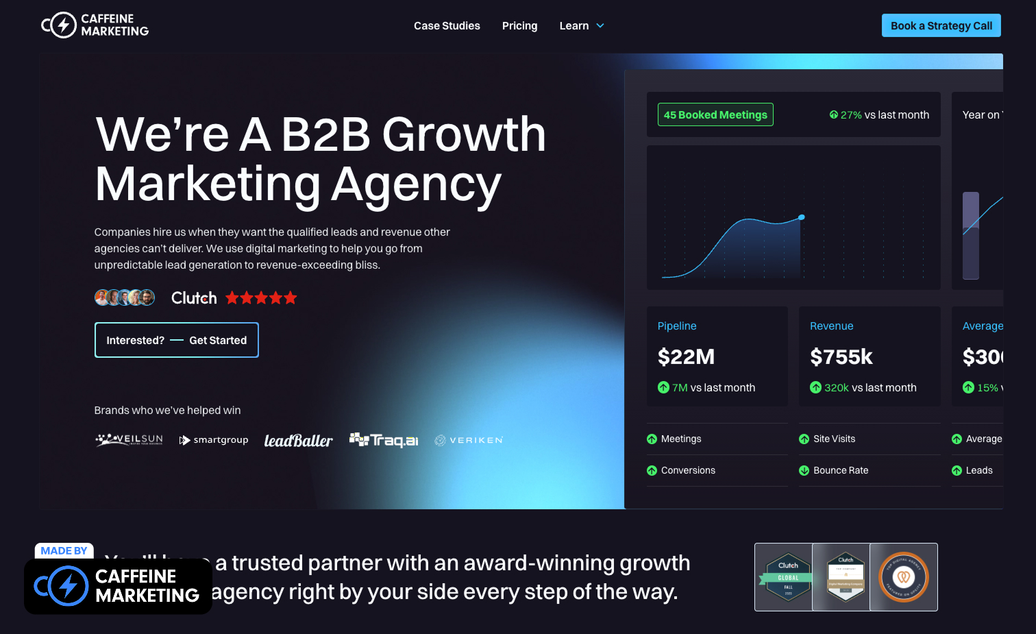
Alright, we're going to start with a bit of shameless self-promotion here. Yes, it's our own landing page at the top of our list. But we've put our money where our mouth is when it comes to B2B SaaS landing page best practices.
The Caffeine Marketing homepage is a lead-generation landing page demonstrating what we preach: clear value proposition, compelling visuals, and conversion-focused design elements.
What makes this landing page effective is its laser focus on what B2B SaaS clients actually care about: measurable results.
Rather than filling the page with marketing jargon, we showcase real metrics – $22M in pipeline, 45 booked meetings (up 27% month over month), and specific cost-per-lead figures that prove we know what we're doing.
The page doesn't just tell visitors we're good at B2B marketing; it shows them with concrete evidence.
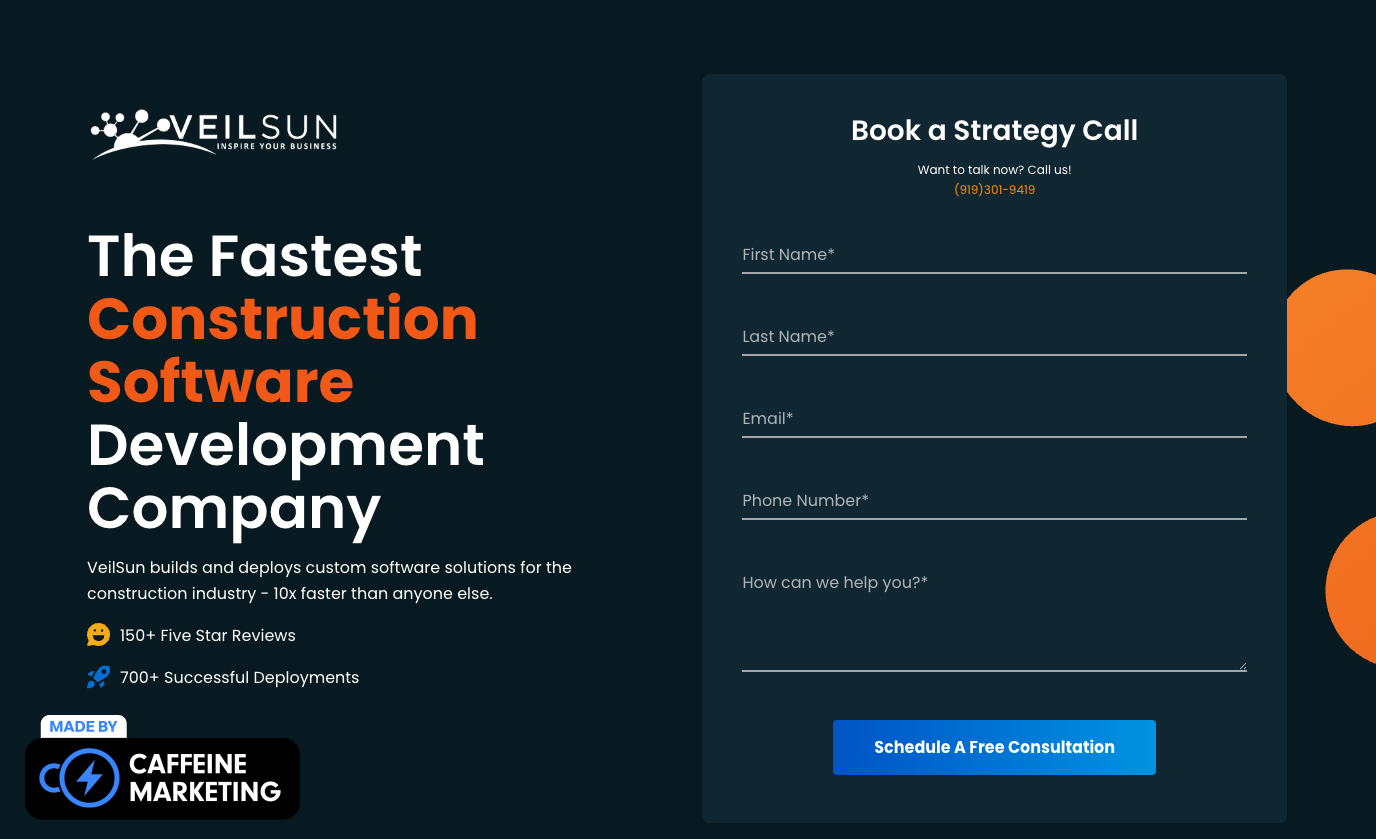
We’re big fans of VeilSun's landing page. They built their landing pages to drive conversions by focusing on industry-specific targeting while maintaining a clean, focused design. It wins because it immediately communicates their value proposition to SaaS decision-makers.
As a Mendix development partner, they've created separate solution sections for different industries (construction and healthcare). They display a deep understanding of sector-specific challenges while keeping their core SaaS offering clear.
The page transitions from industry solutions to impressive metrics (10x faster implementation, 40% reduction in operational overhead) and backs credibility with recognizable client logos like Toyota and Skanska—a masterclass in building trust quickly for SaaS products.
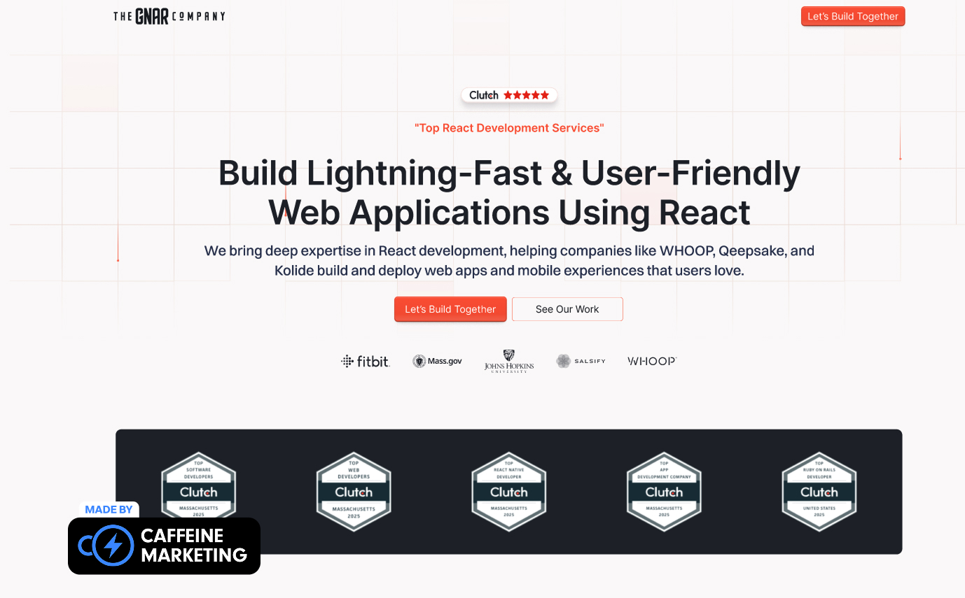
The Gnar Company's landing page is fun and super effective. It shows how a React development service can create a visually compelling yet conversion-focused experience for SaaS products.
Their design strikes a perfect balance between technical credibility and accessible messaging, using a clean grid-based layout that subtly reinforces their development expertise while making complex SaaS offerings easy to understand.
They place a powerful client testimonial at the top, followed by case studies of recognizable organizations like AARP Foundation that showcase measurable results (40% fewer clicks) – exactly what SaaS buyers need to see.
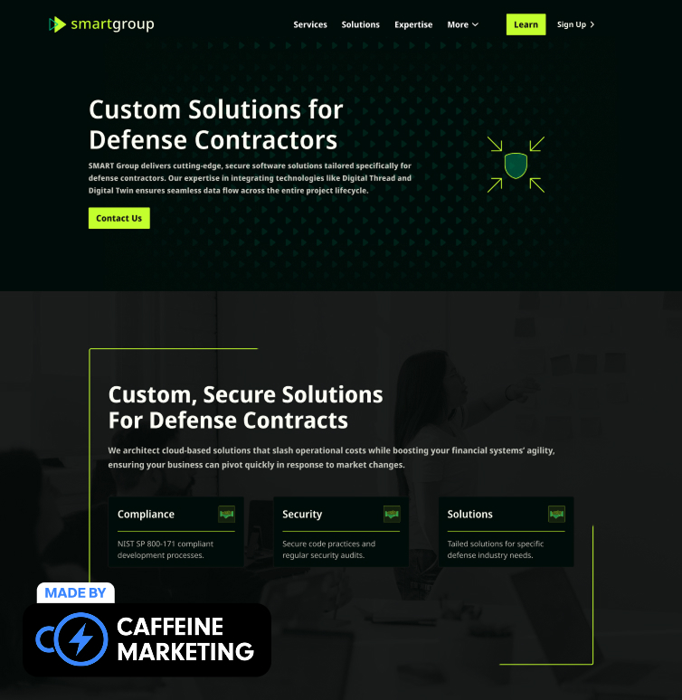
SMART Group's landing page stands out for its laser-focused targeting of a specific B2B SaaS niche (defense contractors) with specialized security needs.
This approach is particularly effective because they emphasize their NIST SP 800-171 certification and position it as a competitive advantage for potential clients.
Throughout the page, SMART Group consistently ties features to tangible outcomes, such as "saving 30% in costs" and "increasing contract win rates," speaking directly to the metrics that matter to defense industry executives.
This B2B SaaS landing page shows that sometimes the most effective pages aren't trying to appeal to everyone. They're laser-focused on speaking the language and addressing the specific concerns of a clearly defined target audience.

ActiveCampaign's landing page tackles this pain point head-on with its customer-centric messaging that focuses on solving personalization challenges rather than listing features.
Their headline immediately resonates with SaaS marketers struggling with audience segmentation.
The page excels by showing the actual platform interface rather than relying on generic descriptions, allowing visitors to visualize how the solution would work in their specific context.

Monday.com's landing page cleverly showcases its actual platform interface right behind the form fields, giving visitors a sneak peek of what they're signing up for.
This product-led approach pairs perfectly with their strategic messaging about integrations with tools like Slack, demonstrating both ease of use and connectivity.
Their headline directly addresses the core benefit: organizing work in a way that's visual and accessible to teams, cutting straight to the value proposition without unnecessary fluff.

Tired of complicated setup processes that delay your business launch? Shopify's landing page cuts straight to the solution with an ultra-simplified signup approach requiring just an email address to begin. This low-barrier entry point perfectly targets busy entrepreneurs who need to move quickly without wading through lengthy forms.
They've strategically positioned social proof elements directly below the signup form, creating an immediate sense of belonging to a successful community of businesses.

HubSpot's landing page brilliantly segments visitors based on their specific needs, creating customized paths to conversion instead of overwhelming them with the entire product suite. This personalized approach ensures visitors feel like they're getting a tailored solution rather than a one-size-fits-all offering.
Their strategic use of social proof places customer logos and testimonials directly alongside conversion elements, building credibility precisely when visitors are making their decision.

Where does work happen? Slack's landing page boldly positions their platform not just as a chat tool but as "where work happens"—a complete workspace for collaboration. This strategic repositioning elevates the product from a simple messaging app to an essential business productivity platform.
The page uses animated visuals to demonstrate how conversations turn into actions, showing the transformation from communication to results in a way that speaks directly to productivity-focused SaaS buyers.

Asana's landing page cuts through the noise with a clean hero section that immediately communicates their core value proposition: helping teams organize, track, and manage their work.
The ample white space creates breathing room that reflects the organized experience their platform delivers.
Their strategic placement of a product demo video allows visitors to immediately see the platform in action, understanding its functionality within seconds rather than having to read lengthy descriptions.

Segment's landing page features a brilliantly simple signup process that reduces friction for visitors coming from ad campaigns.
The approachable form layout and transparent feature listing create immediate clarity about what users will get, while strong social proof builds instant credibility.
The page cleverly uses a "Companies like yours use Segment" section, displaying logos that reflect their ideal customer profile and encouraging visitors to self-identify as qualified prospects.

Kajabi's landing page leverages user testimonials and star ratings alongside quantifiable results to build immediate trust with potential customers. Their compelling headline directly addresses the core pain point of course creators: the technical complexity of building an online business.
Multiple strategically placed CTAs throughout the page capture leads at different stages of the decision journey, ensuring no potential customer falls through the cracks no matter where they stop scrolling.

Riverside's landing page stands out with interactive components in the hero section that demonstrate the product's recording capabilities right from the start. Their "free plan, no credit card needed" offer creates an irresistible low-risk entry point for potential customers.
The page maintains focus with a single, clear CTA throughout, eliminating decision fatigue and guiding visitors toward the primary conversion goal with helpful supporting elements like social proof and quick use case discovery.

Later's landing page offers visitors a free account option front and center, removing financial barriers to initial adoption. The heavyweight social proof featuring major brand logos like Adobe and Food Network creates immediate credibility with businesses of all sizes.
The page strategically combines transparent pricing information with compelling testimonials, creating a conversion path that addresses both rational decision-making factors and emotional reassurance.

Dropbox's DocSend landing page is a masterclass in conversion-focused concision, offering visitors a free start option with minimal friction. The clean, simple design eliminates distractions while still providing essential information about the solution's capabilities.
The strategic inclusion of live chat support creates an immediate connection point for visitors with questions, while the single, clear "Try it free" CTA maintains laser focus on the primary conversion goal.

6Sense's landing page uses direct competitor comparisons and strategic copy that speaks directly to account-based marketing pain points. The condensed, feature-focused design paired with a simple form creates a frictionless conversion path for B2B buyers.
Their inclusion of a chatbot provides instant engagement for visitors with questions, while maintaining the page's clean, focused layout that prioritizes conversion over exploration.

Looking for a CRM that actually integrates with your existing tools? Zoho's landing page targets competitor search terms with a comparison-focused approach that highlights their integration capabilities. Rather than generic messaging, they speak directly to prospects researching alternatives to competitors like Mailchimp.
The page features simplified navigation that directs visitors to relevant product information without distractions, keeping them focused on the conversion path rather than general exploration.

Salesforce shows that effective landing pages use numbers to communicate value. Their straightforward approach highlights that aesthetics aren't everything for conversions—what matters is compelling metrics that showcase their value proposition with tangible results instead of vague claims.
The page strategically places impressive metrics as visual anchors that pull visitors through the content, creating momentum toward conversion without requiring extensive reading or exploration.

Datadog's landing pages showcase effective immediate-value communication for B2B SaaS. They provide concise copy that delivers relevant information quickly, without overwhelming visitors with technical jargon or excessive detail about their monitoring platform.
Instead of burying visitors in text, they use clear, benefit-oriented headlines and visual representations of their interface to convey complex monitoring concepts rapidly, ensuring understanding for both technical implementers and business decision-makers.
The best B2B SaaS landing pages immediately communicate their value—within seconds, not minutes. Your headline must instantly address the specific pain points keeping your prospects up at night, connecting your solution to measurable business outcomes.
Generic testimonials aren't enough for SaaS purchases that often involve significant investment and potential risk. Top-performing pages strategically display trust signals calibrated to SaaS concerns: security certifications, uptime guarantees, integration capabilities, and client logos from recognizable brands.
Every additional form field decreases conversion rates by 4-8%. High-converting SaaS pages capture just enough information to qualify leads without barriers, often starting with minimal fields and gradually collecting more data through nurturing. The best pages provide multiple conversion paths suited to various stages of the SaaS buying journey.
Slow-loading pages with technical issues send an immediate subconscious signal: if you can't optimize your own digital presence, why should visitors trust you with their business operations? The highest-converting SaaS landing pages demonstrate technical excellence through flawless implementation, responsive design, and optimal loading speeds.
At Caffeine Marketing, we've helped many leading B2B SaaS companies turn their landing pages from generic tech brochures into powerful lead-generating assets that deliver measurable business results.
Our approach combines technical expertise with conversion optimization to create pages that don't just look impressive. They drive qualified leads and revenue.
Ready to see how your B2B SaaS landing page stacks up against these industry leaders? Book a free 30-minute consultation with our team today.
We'll analyze your current landing page performance and identify specific opportunities to increase your conversion rates and lead quality.
Schedule Your Free Landing Page Audit
An effective B2B SaaS landing page should have a clear, benefit-focused value proposition, trust signals for software purchases, visual demos of the platform, multiple conversion paths for various decision stages, and performance optimization that reflects product quality.
Page load speed is critical. Each second of delay reduces conversions by 7%. For SaaS companies, slow performance loses conversions and undermines the promise of efficient, technical solutions. Optimize for under 2 seconds to maximize conversion rates and perceived quality.
The most effective approach is a balanced "capability-outcome framework" that briefly establishes technical credibility, then immediately translates capabilities into specific business benefits.
Most successful B2B SaaS companies maintain multiple landing pages tailored to different buyer personas, use cases, and marketing channels. Rather than relying on a one-size-fits-all approach, create dedicated pages for specific ad campaigns, feature highlights, and industry solutions to maximize conversion opportunities.
Implement a structured A/B testing program focused on high-impact elements: headlines, CTAs, form length, social proof, and visuals. Establish baseline conversion metrics, then test one variable at a time using statistically significant traffic samples (at least 1,000 visitors per variation).
