Think of the last time you landed on a website that just...worked. The flow was seamless. The design, intuitive. Within seconds, you grasped the value proposition. And taking the next step felt like the only logical choice.
When it comes to fintech, nailing this experience is critical. New startups launch daily in this hyper-competitive space. For them and established players alike, standing out with stellar landing pages that convert is an imperative.
But what defines an effective fintech landing page that actually converts visitors into engaged customers? While there are plenty of ways to build a landing page, there’s key ingredients that the best fintech sites use to transform impressions into action. In this article, we'll break down the essential elements for high-impact fintech landing pages.
Looking at 7 real-world examples, we’ll analyze exactly what works and why—from clean design to value messaging to calls-to-action. And when you’re ready to implement these methods into your own Fintech website, Caffeine Marketing is here to help you make it a reality.
In the fast-paced world of fintech, standing out with a stellar landing page is critical for converting visitors into leads and customers. But what exactly makes an effective fintech landing page that drives conversions?
Psychologically, high-performing fintech landing pages tap into core human motivations. They clearly communicate the value proposition within seconds, alleviating visitors' anxiety around understanding the offer. Through clean design, compelling visuals and concise copy, they build a sense of trust and credibility. And they provide a clear path for visitors to take action, satisfying their need for direction.
On a practical level, some key ingredients set the top fintech landing pages apart:
By tapping psychology and best practices, high-impact fintech landing pages turn prospects into leads, users and brand advocates through the connection they forge. Figure out how to implement this recipe across your brand - and you’ll quickly find yourself inundated with quality leads!
Humans are wired for story. When done skillfully, storytelling hooks visitor emotion and helps them see themselves as the hero of the tale - increasing likelihood of conversion. Savvy fintech firms employ storytelling elements on their landing pages through the Storybrand framework pioneered by Donald Miller.
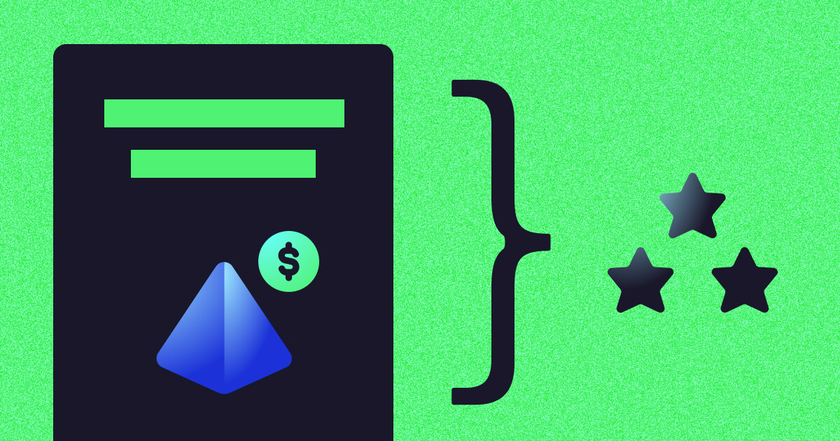
Here’s a simplified version of the Storybrand framework:
By incorporating such storytelling principles - while addressing core human needs and psychology - fintech firms present visitors with an irresistible offer. Site visitors readily assume the hero role once content resonates emotionally and they grasp how the brand can guide them into the financial promised land with their cutting-edge tools, tips or services.
Our team of award-winning StoryBrand marketers is ready to help you exceed your revenue goals.
Here's what to expect:
We look forward to talking to you. 👋
{{book-a-call="/cta"}}
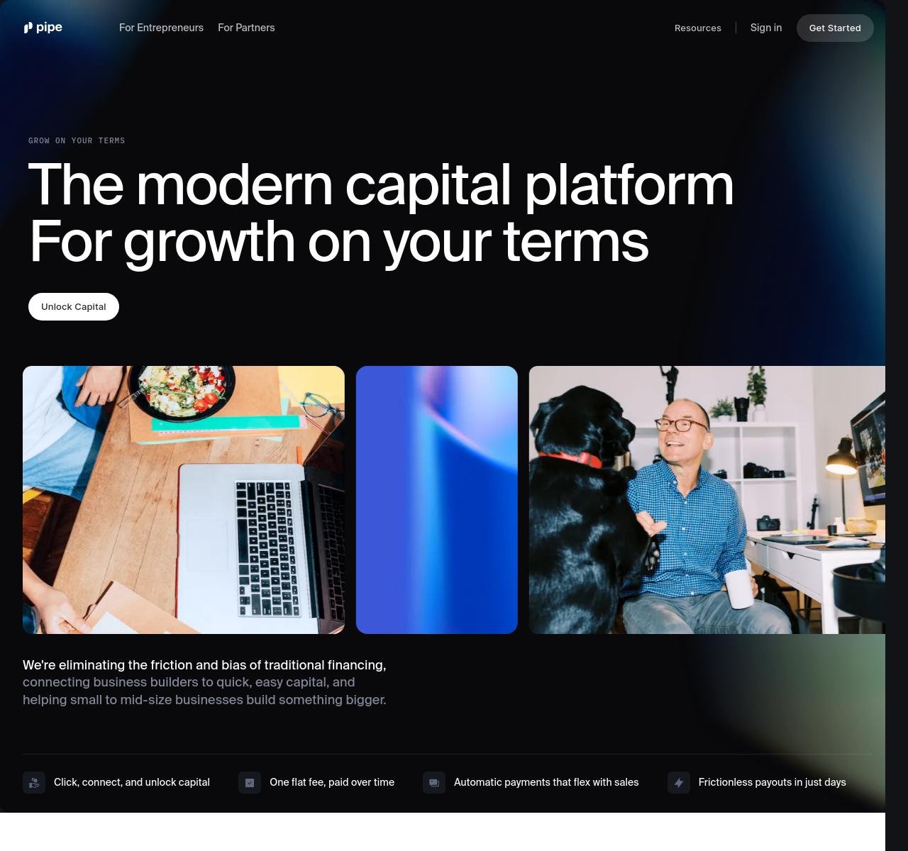
At first glance, Pipe's landing page stands out for its vibrant blue backdrop contrasting crisp, white text - instantly establishing the bold fintech brand. Yet vibrant imagery balanced against ample whitespace creates an uncluttered elegance befitting Pipe’s positioning as a premium capital access portal.
The page taps psychology with hero-focused copy, placing site visitors in the driver's seat to "unlock capital on your terms" while a guide-like interface promises to eliminate financing friction. Further elements foster connection and trust:
While Pipe's landing page features many current fintech best practices, their user navigation truly stands apart as intuitive. Options are presented clearly for "Entrepreneurs" and "Partners" so visitors can self-direct to relevant content quickly. And calls-to-action urge seamless connectivity, promising capital upon click rather than eventual access after lengthy sign-up.
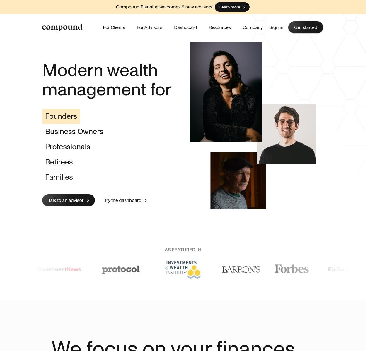
Compound makes a solid first impression with a clean website interface prominently featuring its logo - establishing the brand instantly. Crisp black headlines pop on a bright white/cream background, with bold typography that's professional yet approachable - much like the tailored financial advisors Compound promises to connect visitors with. Remember - the landing page should tell a story!
The site employs key elements to convey Compound's positioning as wealth management tailored to the modern world:
While many fintechs chase the same millennial dollar, Compound sets themselves apart by making wealth management seamless for multiple generations. The site conveys their modern approach through a clean interface with no barriers to entry - as evident by CTA copy promising users can bypass paperwork and directly access advisor matching or portfolio dashboards upon click.
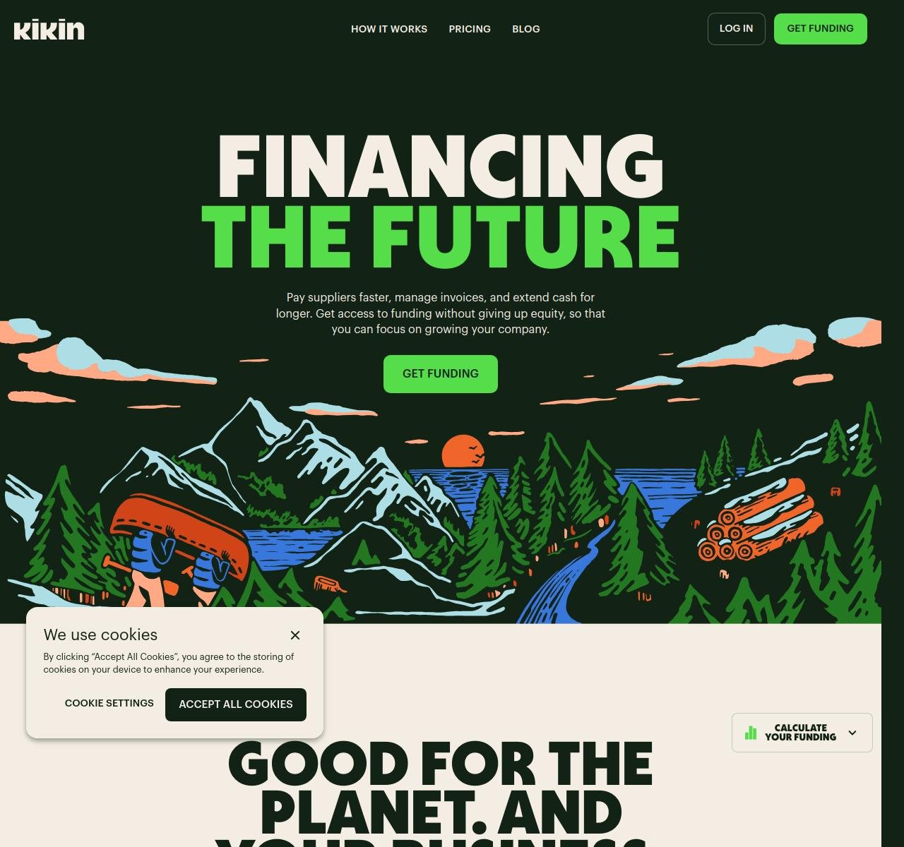
Kikin makes a distinctly vibrant first impression for a fintech firm, with earthy greens and natural wood textures befitting their eco-conscious mission. Typography as nourishing as the landscapes pictured, urges visitors to "Finance the Future" with invoice factoring free of equity sacrifice.
While many landing pages overlook aesthetics for function, Kikin strikes an artful balance using design to reinforce their values. Key elements include:
These touches work synergistically to form deeper emotional connections, promising services attuned to the future of both entrepreneurial dreams and global wellbeing. While details on Kikin’s fintech elements may seem to live secondary to the feel-good imagery, the "Get Funding" CTA provides a gateway to functionality - beckoning businesses towards a model that doesn’t sacrifice finances or values.

Tandym makes a vibrant first impression with their deep green backdrop - suggesting prosperity and seamless financial transactions. Prominent headline copy quickly establishes their value proposition: enabling brands to tap directly into consumer wallets by becoming the card itself. Supplementary imagery resonates by featuring a stylized female shopper on an app-like interface - a warm grin implying rewarding loyalty through Tandym.
The site employs key strategies to convey Tandym’s positioning as the fintech portal between customer and brand:
While Tandym reveals few details about its payment functionalities upfront, its effective blending of emotive loyalty propositions alongside financial efficiency promises compels further clicks. The site successfully associates economic and emotional resonances to foster brand-consumer bonds - converting casual visitors into enraptured subscribers with benefits for both parties.
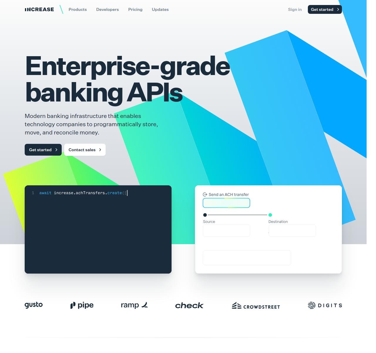
Increase makes a polished first impression fitting of its positioning as an elite financial API platform. Crisp whitespace surrounds core elements like the prominent blue header housing its bold product tagline: “Enterprise-Grade Banking APIs”. The descriptive tech headline paired with geometric graphics and coding snippets convey sophistication beyond most fintechs.
The site employs key strategies to reinforce Increase’s market presence as a seamless banking integrator for platforms worldwide:
While Increase's landing page doesn't give a ton of insight into their financial products, its modern design allows the polish to speak volumes. By balancing aesthetics with functionality, Increase manages to stimulate and satisfy at once - converting developers drawn to well-coded solutions for banking bottlenecks.
{{b2b-webinar="/cta"}}

We love Titan’s fintech landing page for it’s professional-feeling dark backdrop and metallic gold accents - reflective of the elite investments it offers. Top-line messaging packs a one-two punch, establishing its value prop: “Investing, made smarter” - implying AI-driven intelligence tailored to the user.
The site further drives Titan’s positioning as the portal to sophisticated wealth management for millennial horizons and sensibilities through:
While the About and Team pages reveal more on Titan’s backers, the sleek landing page provides just enough on offerings for the target demographic. Its design sophistication implies elevated status - yet approachable menus welcome new visitors to wealth services crafted for their digital-first mentalities. The crafted balance between exclusive and accessible converts aspirational signups.

The Atlas fintech landing page makes a soft statement with a pastel backdrop and artistic lighting, setting an ambient scene befitting the premium debit card took center stage. Top-line messaging leads with the bold header “No Limits” - encapsulating the card’s promise of barrier-free access to exclusive lifestyle events and services.
The site employs key strategies to convey Atlas’ positioning as one’s passport to luxury living:
While the About page likely lists the team and backers, Atlas’ landing page instead spotlights its most premium offering - the card itself.
By framing functionalities via experiential benefits, Atlas manages to make banking beautiful. Its artistic direction transforms utilitarian monetary services into bespoke currency for the cosmopolitan class - converting signups seeking access to the luxury life.
A stellar fintech landing page balances aesthetics and purpose - converting impressions into action while telling a compelling story. The examples we’ve analyzed demonstrate what best-in-class design paired with strategic copy can unlock - namely, quality leads that convert through the funnel.
Now it's time to make your own fintech brand stand out. Convert visitors into leads, users, brand advocates. See your subscriber base scale as your site resonates on emotional and practical levels.
Caffeine Marketing brings over a decade of specialized expertise perfecting high-performance fintech landing pages. Named a top fintech marcom agency by Clutch, UpCity, EOS, and Manifest, we leverage insight into human psychology with proven digital strategies to create stunning content and design.
Book your free 30-minute consultation today to get insights from award-winning fintech marketers - including quick wins to accelerate growth. There's no obligation beyond sparking a game-changing conversation just one meeting away.
