
When global cybercrime costs are projected to hit a staggering $10.5 trillion annually in 2025, your cybersecurity landing page can be your first line of defense in converting security-conscious prospects into customers.
While other agencies focus on vanity metrics that don't grow revenue, we know what matters: qualified leads that turn into booked meetings and closed deals. That's why we've analyzed the 16 most effective cybersecurity landing pages of 2025 – pages that don't just look good, but actually drive conversions.
With 45% of global organizations projected to be affected by supply chain attacks this year, your prospects are actively searching for solutions. The question is: will your landing page convert them, or will they bounce to your competitors?
Stop losing time and money on false starts. Let's unlock the secrets to predictable growth with landing pages that actually generate qualified leads.
{{book-a-call="/cta"}}
When it comes to cybersecurity landing pages that convert, there's a massive difference between what most companies do and what actually works.
While your competitors focus on flashy animations and technical jargon, the top-performing pages we've analyzed share key elements that drive results in the form of revenue:
The best cybersecurity landing pages immediately communicate their value. We’re talking seconds, not minutes.
With 70% of data breaches causing significant disruptions to organizations, your headline needs to immediately address the pain points keeping your prospects up at night.
When trust is everything, generic testimonials won't cut it. Top-performing pages strategically display security certifications, compliance badges, and client logos from recognizable brands to establish immediate credibility.
The conversion leaders use visual elements – from animated vulnerability demonstrations to interactive diagrams – that make abstract security concepts tangible without requiring technical expertise to understand.
The more steps, the less chance to capture. Rather than asking for 10+ form fields, high-converting pages focus on capturing just enough information to qualify leads without creating conversion barriers. They understand that every additional field reduces conversion rates by approximately 4-8%.
The most successful pages segment their messaging based on whether they're targeting enterprises, SMBs, developers, or security professionals – with tailored pain points, solutions, and CTAs for each.
Instead of generic testimonials, conversion-focused pages showcase specific security outcomes: "Reduced breach detection time by 78%" or "Eliminated 99.8% of phishing attempts" – metrics that make the value concrete.
Stop wasting your marketing budget on landing pages that look pretty but don't convert. Let's look at how the industry leaders turn visitors into qualified leads and revenue.
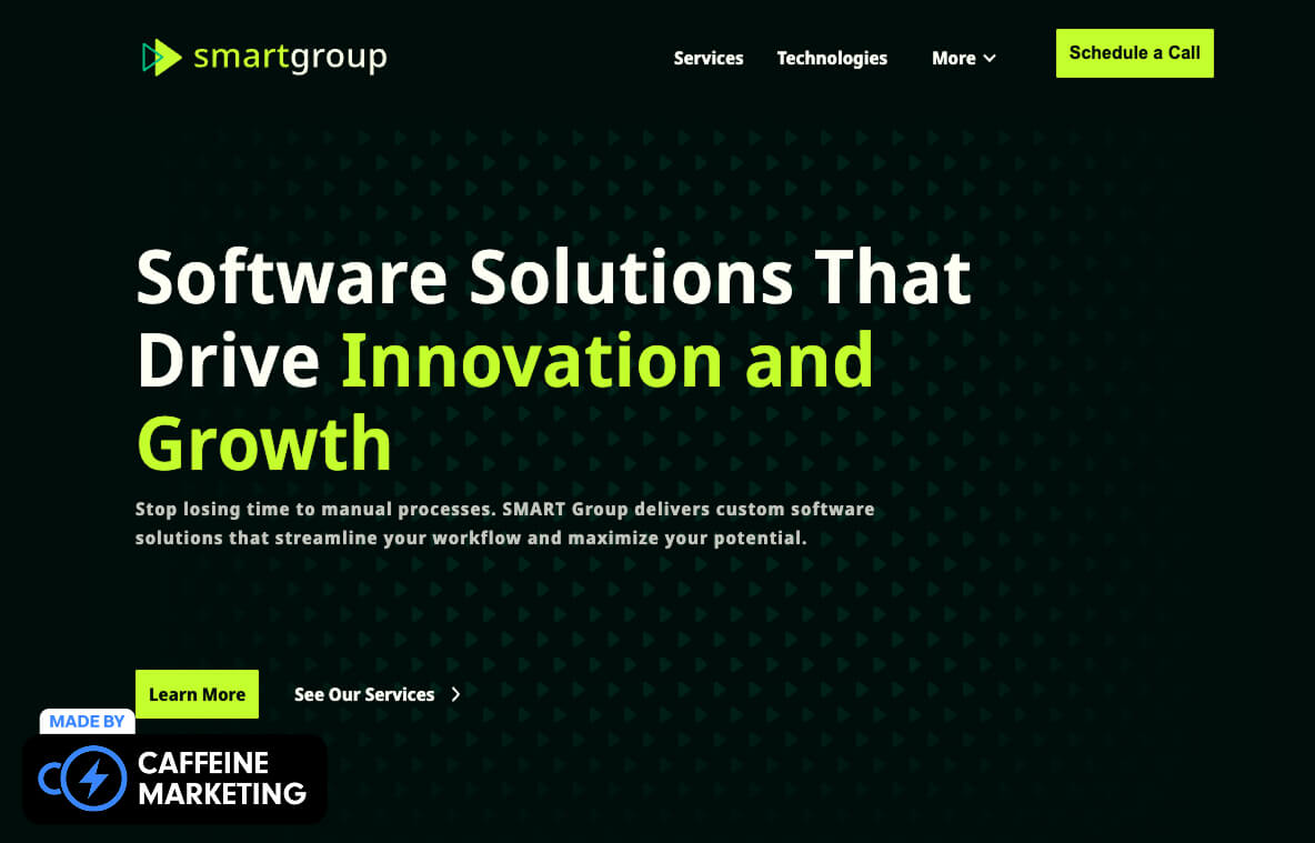
SMART Group's landing page hits you like a neon green punch to the eyeballs – and we mean that in the absolute best way possible. While most cybersecurity websites are drowning in boring blues and generic stock photos of padlocks and binary code, SMART Group blows past the clichés with a bold black background and electric green accents that make their metrics pop off the screen.
Their stats aren’t buried in paragraph four of generic copy – it's front and center with a custom icon that draws your eye exactly where they want it. This isn't just pretty design; it's conversion strategy in action.
Why It's A Great Cybersecurity Landing Page:
When we build cybersecurity sites for our clients, we always point to SMART Group as proof that security websites don't need to be boring to be effective – they just need to balance visual impact with strategic conversion elements.

NinjaOne's landing page balances sophisticated security technology with approachable, human-focused design that makes complex solutions feel accessible to both technical and business audiences.
Why It's A Great Cybersecurity Landing Page:
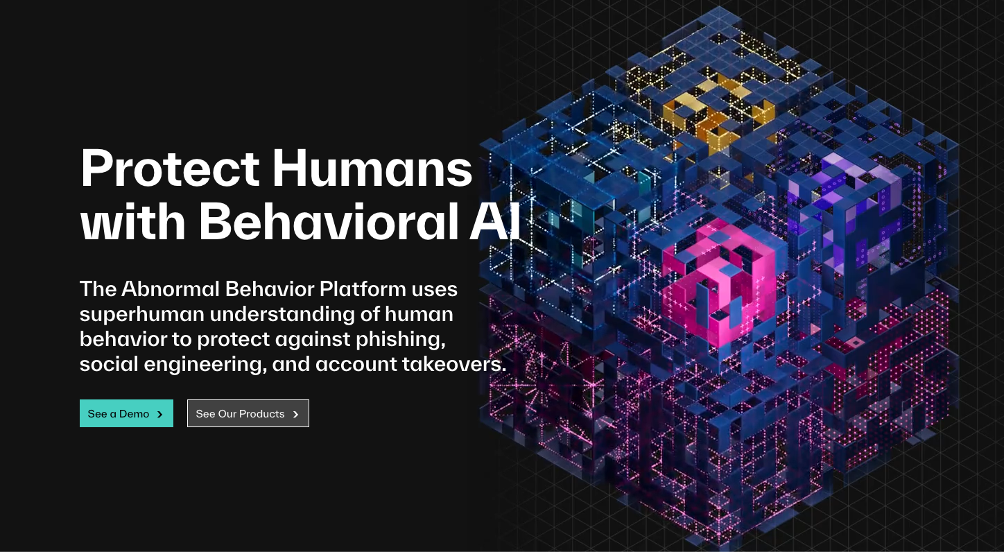
Abnormal breaks the cybersecurity landing page mold with dynamic content that transforms potentially dry email security into a visually engaging experience visitors can't help but engage with.
Why It's A Great Cybersecurity Landing Page:

Endor Labs grabs attention instantly with its striking black background and electric green highlights that create a memorable security brand while making complex vulnerability concepts accessible.
Why It's A Great Cybersecurity Landing Page:

Arctic Wolf's visually striking gradient background creates an instantly recognizable brand while their strategic use of white space ensures visitors focus on conversion elements, not visual clutter.
Why It's A Great Cybersecurity Landing Page:

Picnic's retro-futuristic landing page instantly sets them apart in the cybersecurity space with its distinctive typography and unconventional color scheme that commands attention.
Why It's A Great Cybersecurity Landing Page:

CrowdStrike's landing page leverages their established brand with a cyberpunk-inspired design that visualizes abstract threats while immediately positioning them as an authority figure.
Why It's A Great Cybersecurity Landing Page:

UpGuard's landing page uses dynamic visualization to transform abstract security monitoring into something tangible and measurable that immediately communicates their core value proposition.
Why It's A Great Cybersecurity Landing Page:

Rubrik's landing page uses rich blue gradients and embedded video to create immediate visual interest while elegantly communicating complex cyber resilience concepts to multiple stakeholders.
Why It's A Great Cybersecurity Landing Page:

Doppler's developer-focused landing page uses a sleek dark theme with bold green gradient CTAs to create a technical yet approachable experience for their security-conscious developer audience.
Why It's A Great Cybersecurity Landing Page:

Redline's landing page uses urgent messaging and a split hero design to create immediate impact while strategically guiding visitors toward high-converting call-to-action buttons.
Why It's A Great Cybersecurity Landing Page:

Torq's landing page leverages video animation in the hero section to immediately demonstrate product capabilities while maintaining a sophisticated dark color scheme that exudes security.
Why It's A Great Cybersecurity Landing Page:

Wiz's landing page uses a split layout with friendly imagery and bold, clear messaging that makes cloud security approachable for even non-technical stakeholders.
Why It's A Great Cybersecurity Landing Page:

NordLayer's landing page uses a clean split design that balances clear messaging with product visualization to create an intuitive path to conversion.
Why It's A Great Cybersecurity Landing Page:

Sonrai Security's landing page makes an immediate impact with its bold headline and interactive elements that encourage engagement while maintaining a clean, professional aesthetic.
Why It's A Great Cybersecurity Landing Page:

Judy Security's landing page uses approachable design and imagery to make security accessible to small and medium businesses without sacrificing professionalism.
Why It's A Great Cybersecurity Landing Page:
Different cybersecurity niches require distinct landing page approaches to maximize conversion. The most successful pages in our analysis recognize these differences and tailor their elements accordingly:
The best email security landing pages (like Abnormal) use animated visualizations that show threat detection in action, with clear before/after scenarios that make abstract email threats tangible. They highlight specific threat types with real examples and emphasize time savings in detection and response.
Leading cloud security pages (Wiz, Sonrai) use infrastructure visualizations that transform complex cloud environments into digestible visuals. They demonstrate real-time monitoring through dashboard previews and focus on visibility benefits with compelling "before and after" scenarios.
Enterprise-focused pages (SMART Group, CrowdStrike) emphasize compliance frameworks, technical depth, and sophisticated buyer journeys, while SMB-focused pages (Judy Security) prioritize ease of implementation, affordability messaging, and simplified security education with fewer technical prerequisites.
Developer security pages (Doppler, Endor Labs) speak directly to technical audiences with code snippets, API documentation, and integration capabilities prominently featured. They use GitHub and ecosystem integration badges as trust signals while maintaining a technical aesthetic that resonates with their audience.
The best cybersecurity landing pages of 2025 aren't just visually striking. They're carefully crafted conversion machines that transform security anxiety into qualified leads.
What separates the elite performers from the forgettable is their ability to balance visual impact with strategic conversion elements, technical credibility with accessibility, and security education with clear paths to action.
At Caffeine Marketing, we've helped numerous cybersecurity companies transform their digital presence from technical brochures into lead-generating powerhouses.
We start by rigorously defining your unique security value proposition and the specific threats you address. Then, we build intuitive landing pages that guide visitors through your solutions and demonstrate why you're the best choice for their security needs. Our designs are visually appealing, but never at the expense of functionality.
Ready to see how your cybersecurity landing page stacks up? Book a free consultation with our team today.
Beyond basic traffic, focus on engagement metrics (average time on page, scroll depth), conversion rates by traffic source, form abandonment rates, and most importantly, lead quality scores. The best cybersecurity companies track not just quantity but quality of leads, measuring how many convert to qualified sales opportunities.
High-converting security pages undergo quarterly conversion optimization updates based on performance data, monthly content refreshes to reflect emerging threats, and annual design refreshes to stay current with evolving user expectations. Your security messaging must evolve as quickly as the threat landscape.
Our analysis shows that conversion rates drop significantly after 4-5 fields. The highest-converting pages collect only essential qualification information initially (name, email, company size) and progressive profile visitors through follow-up interactions rather than demanding excessive information upfront.
Follow the lead of top performers by using visual demonstrations instead of technical descriptions, explaining security concepts through relatable analogies and real-world scenarios, and segmenting content for technical and non-technical audiences with progressive disclosure of technical details.
Value-focused CTAs consistently outperform generic "Contact Us" buttons. The highest-converting CTAs offer immediate value ("Get Your Threat Assessment"), address specific pain points ("See Your Risk Score"), or create urgency tied to security concerns ("Secure Your Environment Now"). Always test multiple variations to find what resonates with your specific audience.
Newer security companies can differentiate by focusing on specific niches rather than competing broadly, showcasing the team's security credentials prominently, offering more generous free trials or assessments than established players, and creating comparison content that highlights your advantages in specific use cases.
