Fintech (financial technology) has become a huge trend in the last few years. As financial services continue to embrace digital transformation, services such as digital banking, money transfer services, and investment/trading platforms are popping up all over the web.
And while some of these brands still operate in the physical commercial space, there’s no question that websites are an integral part of their marketing and branding strategies. Fintech websites don’t just offer information about a particular product or service, they are becoming a service in themselves.
Since websites are often the first touchpoint a customer has with a brand, it’s essential for fintech companies to have an attractive and engaging website design that presents their products and services in an understandable way while demonstrating trustworthiness.
Below, we’ve rounded up 30 of the best fintech website designs from recent years to showcase how some top companies are reaching and engaging their audiences. Each website design is unique in its own way, but each one also demonstrates an understanding of the branding, usability, and trustworthiness that are essential for any successful fintech website.
It’s expected that a financial tech company will have a piece of online real estate – but there’s a difference between having a website and having an effective one. A great fintech website should have:
When you arrive at a website, you should feel like you’re in the right place. A user-centric design often includes a clean layout with easy navigation and clear calls to action that help users quickly find what they’re looking for. Consider mobile users as well, since it’s estimated that by 2023, almost three-quarters of the world’s population will be using a mobile device.
A successful website is visually appealing and easy to read. That means no cluttered pages with too much text, confusing layouts, or hard-to-find information. Instead, it should have a clear visual hierarchy that guides users through the page intuitively.
Consistency is key when it comes to branding. From the logo and color palette to tone of voice and font choices, all elements need to match to create a cohesive user experience. This includes proprietary landing pages and microsites as well as product and blog pages.
A great fintech website is pretty to look at, but what do you do once you land on the homepage? You need to ensure visitors can navigate easily from point A to point B. This includes having clear calls-to-action (CTA’s) and well-defined pathways for users to take, such as signing up for a product demo or downloading a white paper.
Content is still king (and queen!) in the fintech space, so a top-tier website will have plenty of excellent copywriting and content marketing efforts.
This should extend beyond the copy on the page but also include downloadable lead magnets, blog content, graphics, and even videos. All of this should be timely, targeted to the right audience, and engaging enough to keep visitors on the site longer.
It goes without saying that when dealing with finances and customers’ data, security is paramount. Therefore an excellent fintech website needs to have strong security protocols in place to keep customer data safe. This may include two-factor authentication, encryption methods like HTTPS, and GDPR compliance.
If your fintech site is offering payment gateway integration, then you should also have PCI-DSS compliance. This protects customers’ card data and ensures that any payments made through the site are secure.
There’s no point in having a great website if nobody can find it in the first place! SEO is essential for higher organic rankings and better lead generation from the site itself. This includes keyword research, metadata optimization, internal linking, and page speed optimization.
Our team of award-winning Fintech marketers is ready to help you exceed your revenue goals.
Here's what to expect:
We look forward to talking to you. 👋
{{book-a-call="/cta"}}
Now that we’ve seen what goes into making a great fintech website, it’s time to look at the best of the best. Here are 30 of the most popular and successful fintech websites from 2023, along with what makes them stand out from the competition:
Digital banking is becoming increasingly popular with those looking for more convenient and secure banking services. And by featuring their services with an outstanding website, these companies are beating the competition fast.
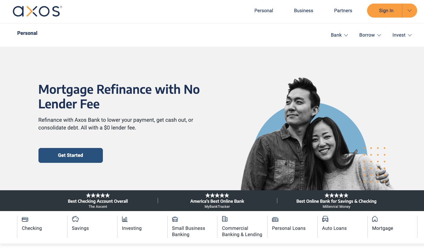
The Axos Bank website presents a clean, modern design that is both inviting and informative, clearly focusing on user experience. The main banner prominently offers a mortgage refinance service with a clear call to action, reflecting their commitment to straightforward financial solutions. The design employs a minimalist aesthetic with easy-to-read fonts and a simple color scheme that directs attention to their services and accolades.
Why We Love It:
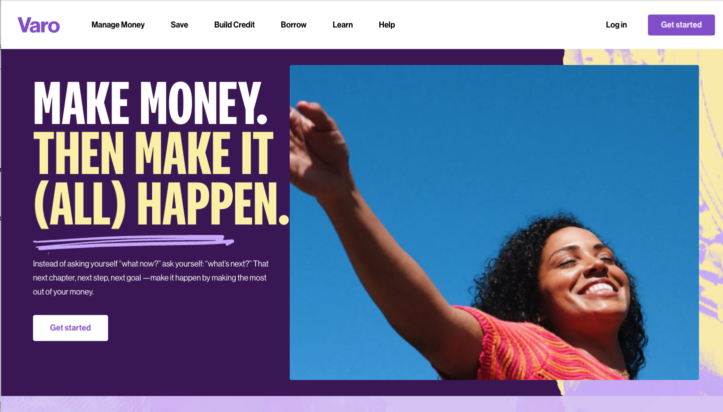
Looking for something a bit more dynamic in your online bank? The Varo Bank website exudes a vibrant and youthful energy with its bold colors and dynamic imagery. A person is seen reaching towards the sky, symbolizing the limitless possibilities that Varo promises with its financial services.
The tagline "MAKE MONEY. THEN MAKE IT (ALL) HAPPEN." serves as a motivational call to action, paired with an inviting button that encourages immediate engagement.
Why We Love It:
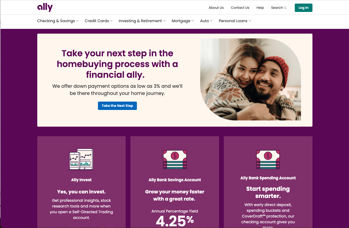
Sometimes you need a simple yet aesthetically pleasing site. The Ally Bank website offers a cozy and welcoming aesthetic, with an image of a smiling couple that underscores the bank's commitment to being a 'financial ally.'
The headline "Take your next step in the home buying process with a financial ally" alongside the prominent call-to-action button "Take the Next Step" positions Ally as a supportive partner in significant financial decisions.
Why We Love It:
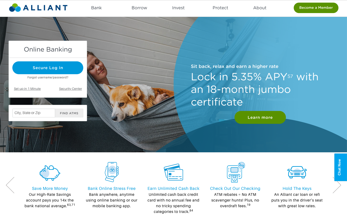
The Alliant Credit Union website portrays a sense of calm and security, essential qualities for a financial institution. The homepage is distinguished by a peaceful image of a person and a dog lounging comfortably, which along with the overlay text, promotes a relaxed approach to earning with their financial products.
The standout offer of a 5.35% APY on an 18-month jumbo certificate is prominently featured, signaling a competitive financial advantage for potential savers.
Why We Love It:
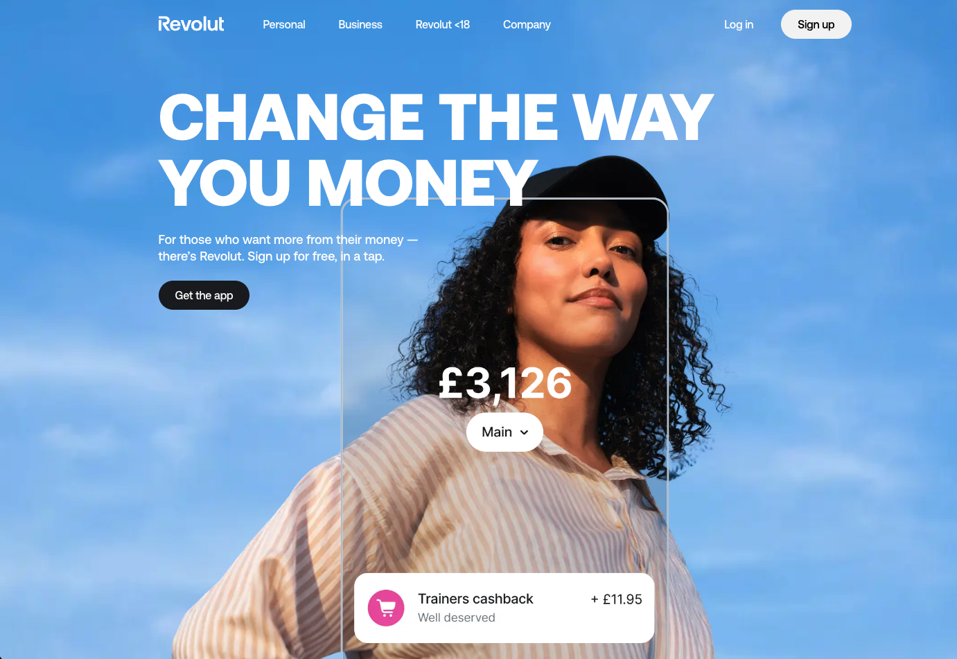
The future is going all-in on digital. The Revolut website captivates a youthful audience with its bold, contemporary design and a clear message of empowerment: "CHANGE THE WAY YOU MONEY." The visual of a confident individual coupled with a casual, direct tone speaks to a generation that values both style and substance.
The modern look, simplicity, and call to action, "Sign up for free, in a tap," appeal to a generation seeking instant digital gratification and control over their finances with a few smartphone taps.
Why We Love It:
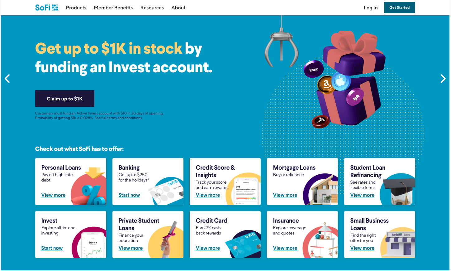
SoFi isn’t new to the scene (SoFi Stadium, for instance.) The SoFi website effectively highlights its range of financial products through a colorful and organized layout. The enticing offer, "Get up to $1K in stock by funding an Invest account," is prominently displayed, appealing to users interested in investment opportunities.
Services from personal loans to banking, credit score insights, and more are instantly accessible, allowing users to quickly find and delve deeper into the details. The design choice to use vibrant icons and clear typography ensures that each offering is not only visible but also enticing.
Why We Love It:
{{b2b-webinar="/cta"}}
If digital banking is growing fast, then digital payments is soaring. The ability to transfer money and pay for services without ever needing cash or a physical card has made life much easier. These digital payment and transfer services are showing how to capture eyes online.
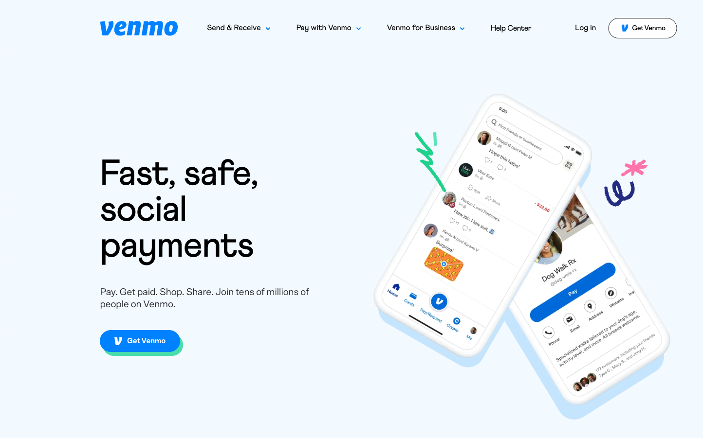
Who isn’t “Venmo-ing” these days? Venmo is a popular payment app that allows users to send and receive money from friends and family. The site, showcasing the main selling point of social payments, is built around an interactive feed of transactions, with plenty of visuals and user activity to pull users in. The design is colorful yet simple, making it easy for users to navigate the site and utilize the features.
Why We Love It:
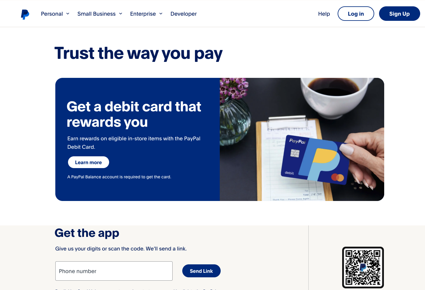
The behemoth of online payments, the PayPal website promotes its services with a clear and appealing message about rewards, urging users to "Trust the way you pay." The clean and straightforward design of the page, with its bold header and an inviting image of the debit card, suggests a hassle-free payment experience with the added benefit of earning rewards.
Why We Love It:
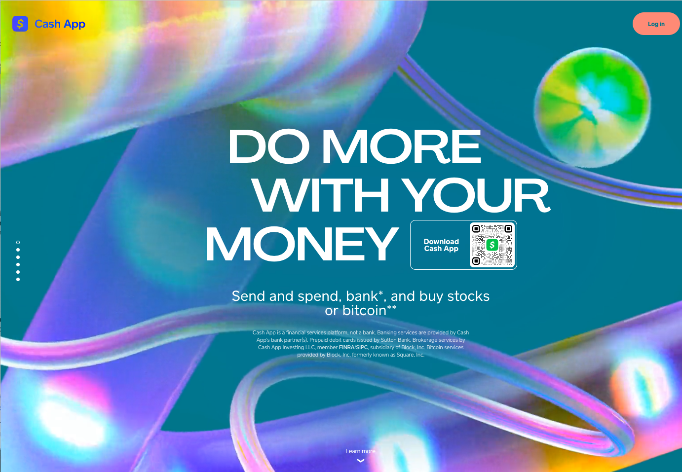
A growing competitor to Venmo is Cash App. The Cash App website showcases a lively and colorful design with a compelling slogan: "DO MORE WITH YOUR MONEY." It emphasizes the app's multi-functionality, allowing users to send and spend money, bank, and invest in stocks or Bitcoin. The presence of a QR code makes it easy for users to download the app, emphasizing convenience and immediate access.
Why We Love It:
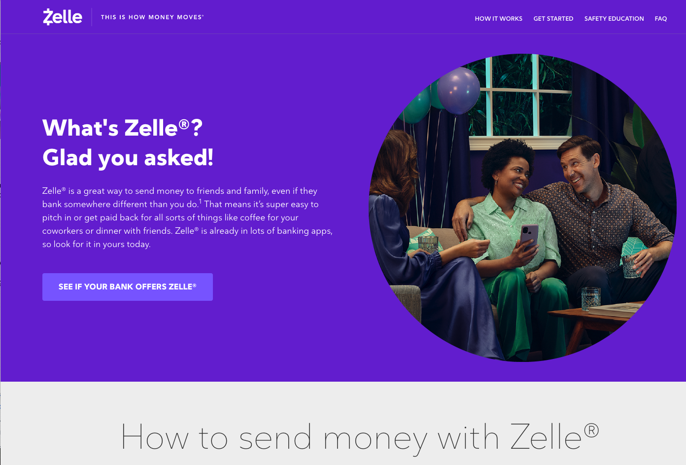
Zelle's website greets visitors with a friendly and informative tone, asking and answering, "What's Zelle?" The site explains that Zelle is a convenient way to send money, highlighting the ease of use for various scenarios like sharing costs with friends or family. It presents the service as widely available within many banking apps, suggesting familiarity and trust.
Why We Love It:
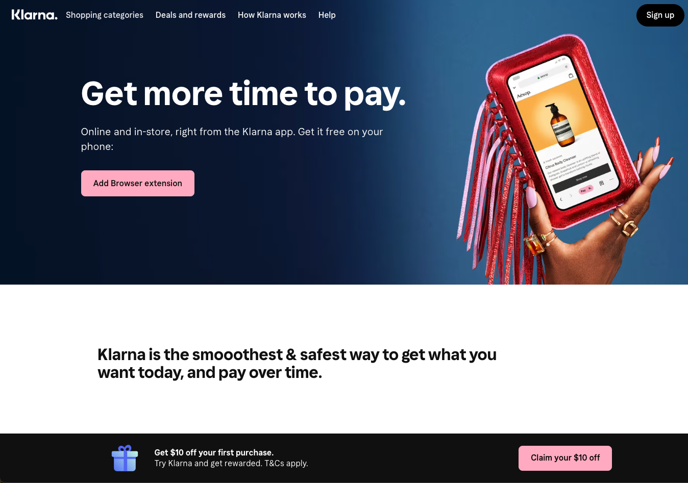
Klarna's website uses bold typography and an engaging image to communicate the convenience and benefits of its payment service. With the tagline "Get more time to pay," Klarna positions itself as a flexible payment solution that allows users to spread the cost of purchases over time. The site also highlights the ease of integration with a prompt to add a browser extension - which gives it an “always-there” element.
Why We Love It:
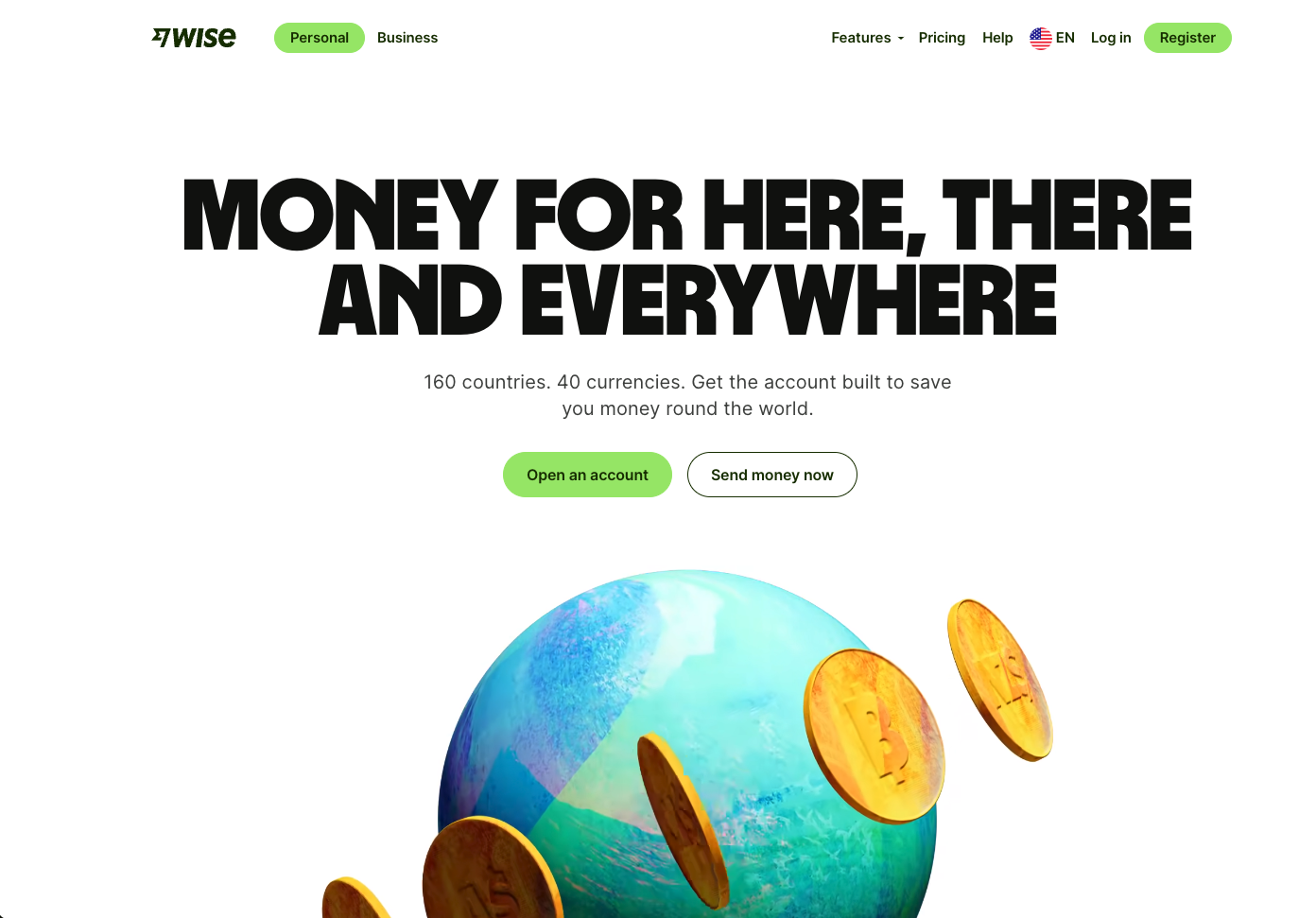
Wise uses its website to highlight its global reach and currency versatility, with the tagline "MONEY FOR HERE, THERE AND EVERYWHERE." It signifies ease of money management across borders, emphasizing the platform's capability to handle multiple currencies and its worldwide service. The visual of a globe with coins implies international money movement and exchange.
Why We Love It:
Apps are a critical part of fintech, with personal finance management apps being some of the most popular. Many of these have features that allow users to track their spending, set budget goals, and move money around with ease. Here are some examples of high-quality personal finance sites that are capturing traffic.
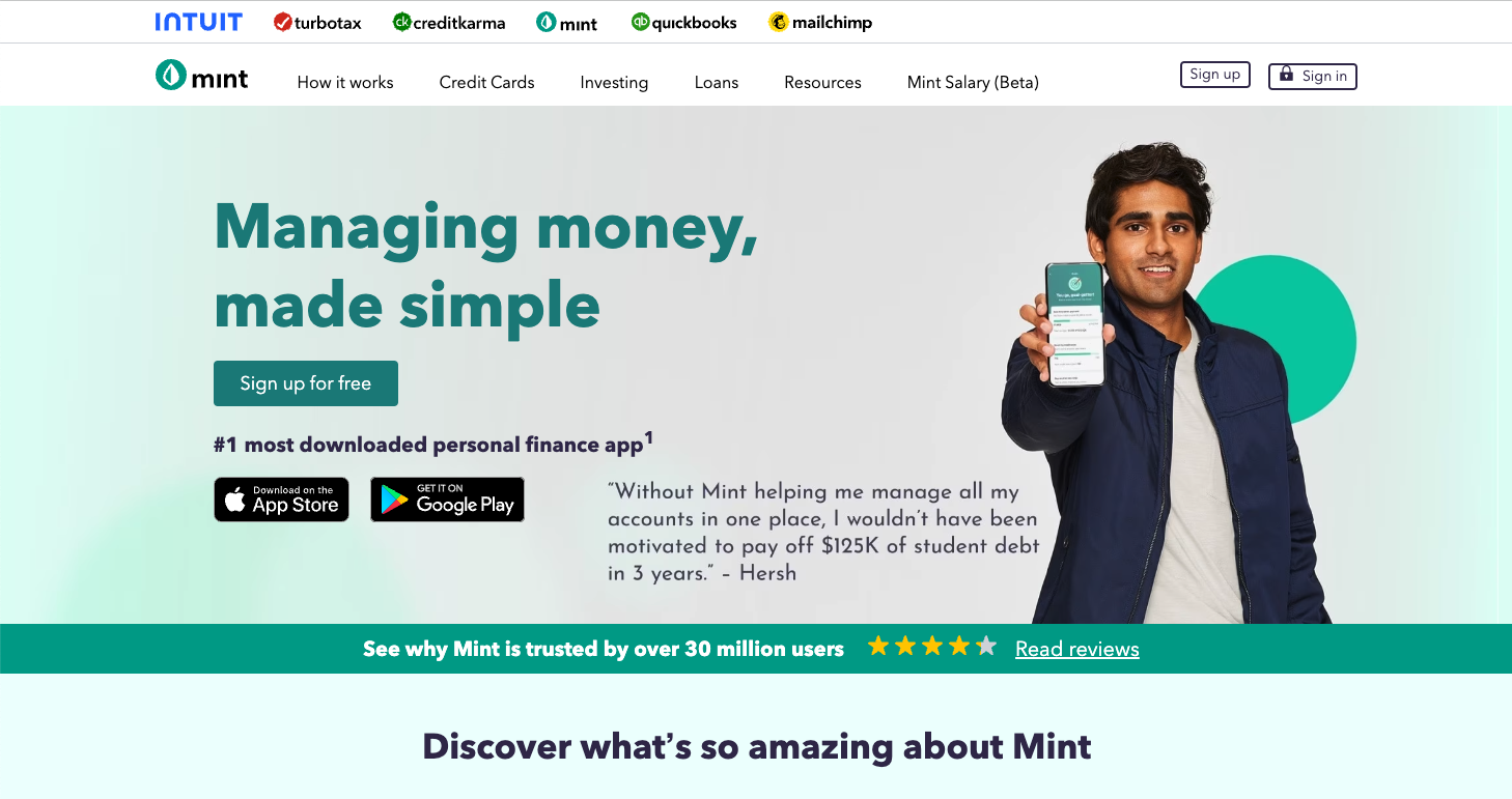
Mint continues to dominate the personal budgeting market with its Intuit capabilities. Mint's website delivers a clear and compelling message about the simplicity and effectiveness of its personal finance tools. The homepage is bright and welcoming, with a statement that positions the app as the "#1 most downloaded personal finance app" – a strong endorsement of its popularity and user satisfaction.
Why We Love It:
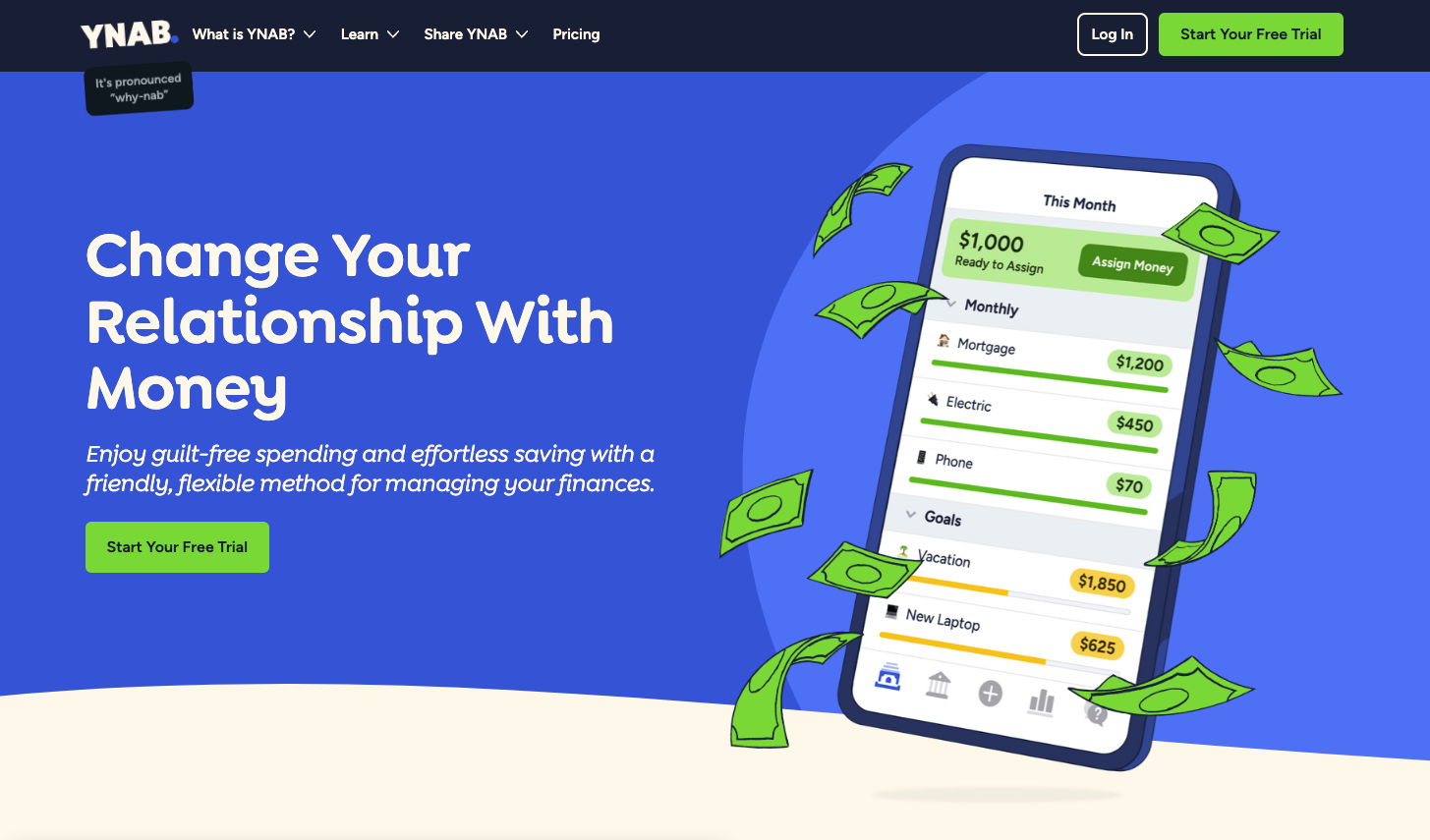
YNAB (You Need A Budget)'s website has a sense of optimism for personal finance management (which we could all use!) The site presents a vibrant and engaging interface that promises to transform the user's relationship with money.
The headline "Change Your Relationship With Money" is both a call to action and a bold statement of the site's core value proposition: empowering users to manage their finances with ease and without guilt.
Why We Love It:
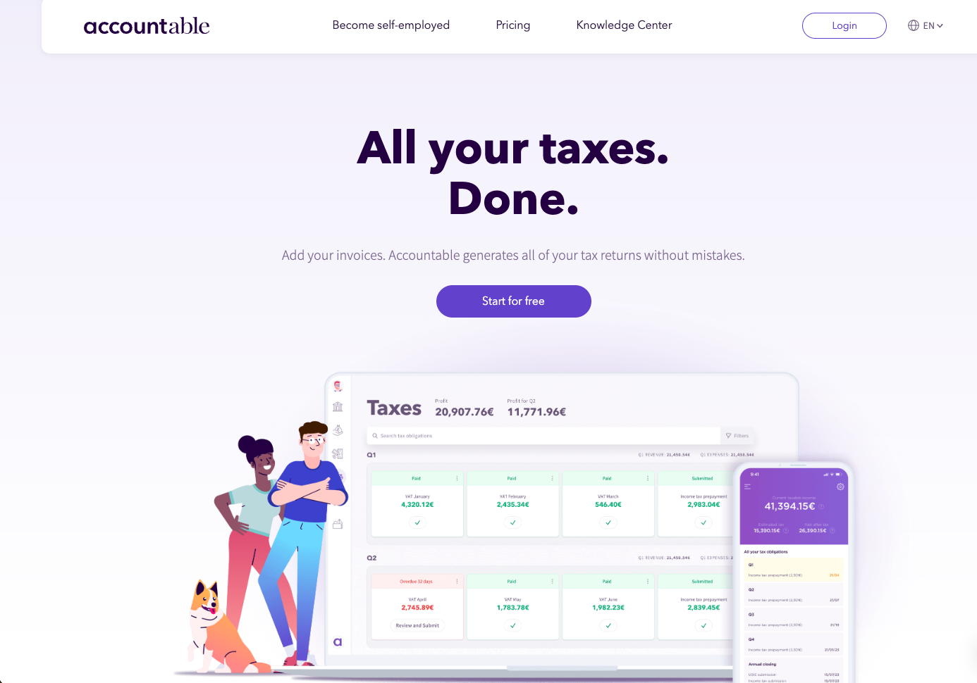
Taxes aren’t fun - but that doesn’t mean the process has to be boring. The Accountable website provides a reassuring message about tax management, emphasizing ease and support.
It reassures visitors with a direct promise: "Never worry about your taxes again," positioning the service as a stress-free solution for independents. Including high ratings from Trustpilot and app stores strengthens the site's message of trustworthiness and customer satisfaction.
Why We Love It:
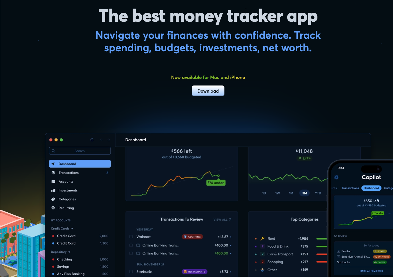
Copilot's website promotes its service as "The best money tracker app," offering a bold statement about its capabilities in helping users navigate their finances. The site's dark theme is professional and modern, with screenshots that showcase the app's user interface, which appears to be both sophisticated and user-friendly. The visuals provide a sneak peek into the dashboard, transactions, and spending categories.
Why We Love It:
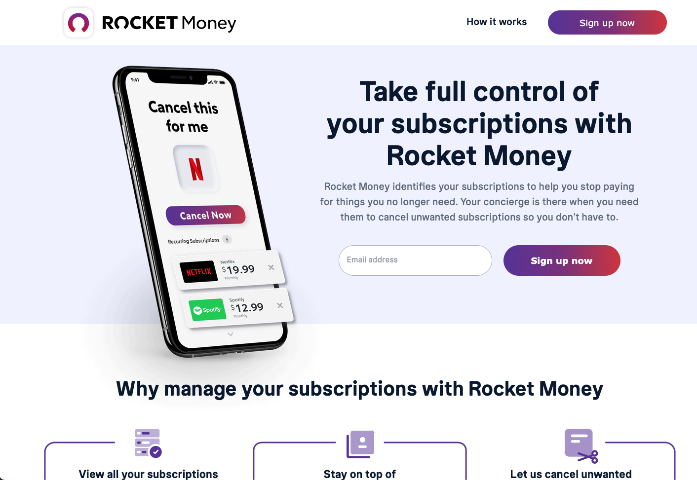
Similar to Copilot yet different in its vibe, Rocket Money's website focuses on a clear and specific value proposition: subscription management. It highlights the convenience of having a personal concierge to cancel unwanted subscriptions, potentially leading to savings. The site features an image of the app interface, where users can cancel subscriptions with just a tap, emphasizing the app's ease of use and practicality.
Why We Love It:
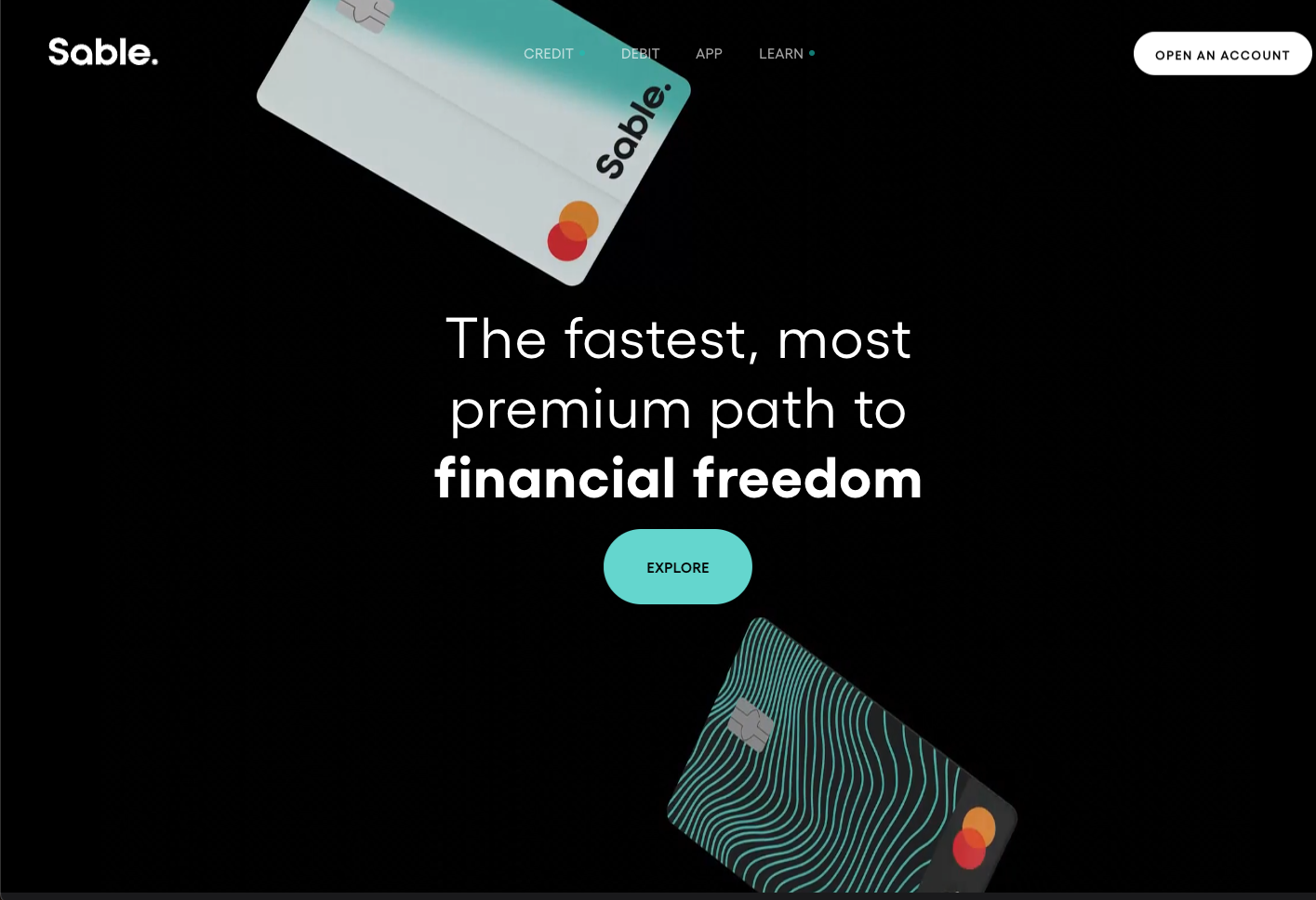
Using high-design, Sable Card's website presents a bold proclamation of speed and luxury in financial management. The phrase "The fastest, most premium path to financial freedom" positions the Sable Card as a top-tier choice for those seeking to streamline their finances. The site's dark theme, punctuated by the image of the sleek Sable cards, conveys a sense of sophistication and modernity.
Why We Love It:
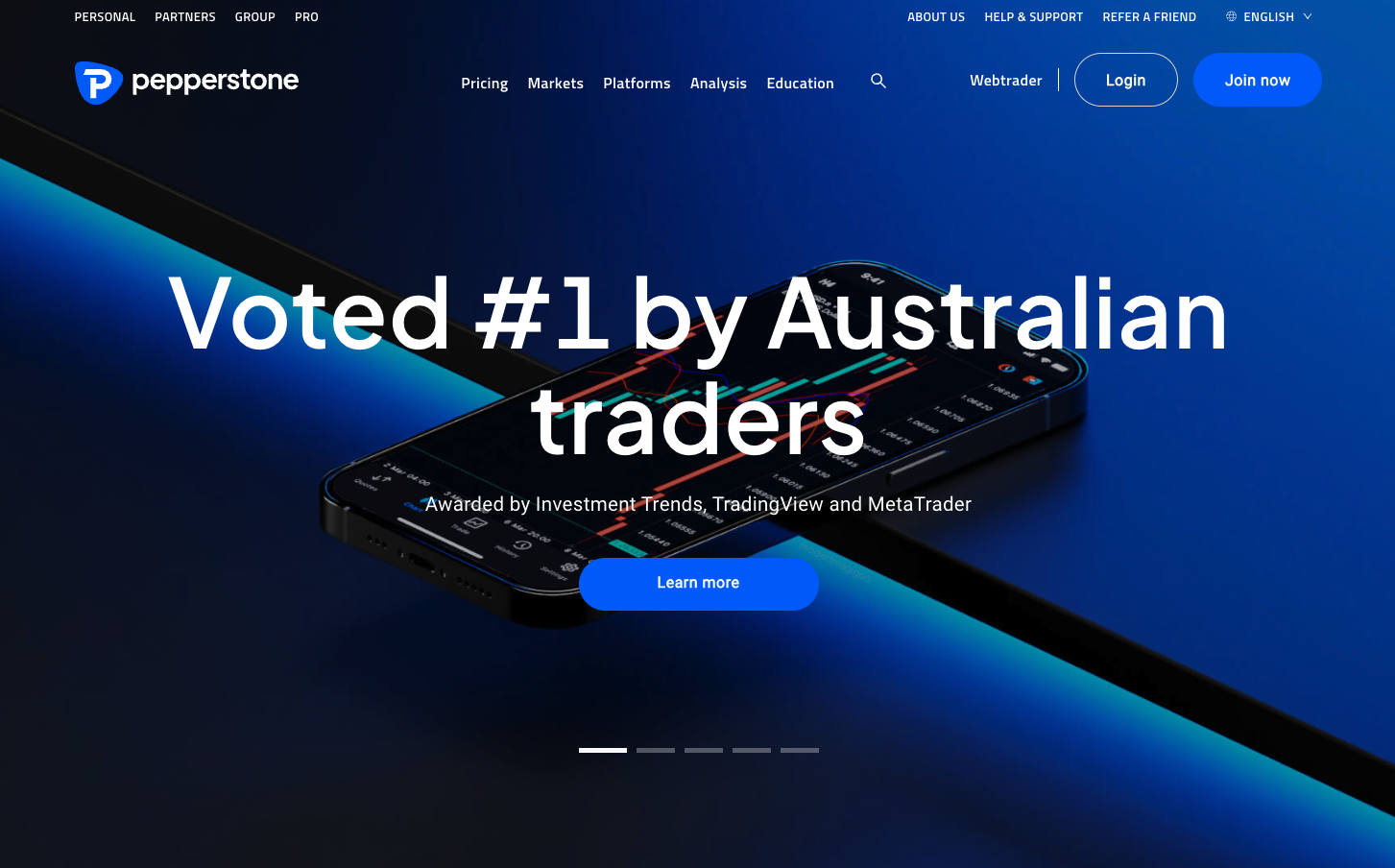
Everyone wants an advantage in the market. Pepperstone's website boasts a sleek and professional look, highlighting its acclaim as the top choice among Australian traders.
The statement "Voted #1 by Australian traders" is prominently displayed, immediately conveying the platform's prestige and popularity. Using the trading interface on the mobile app shows just how serious the company is about its mobile app, even on the desktop website.
Why We Love It:
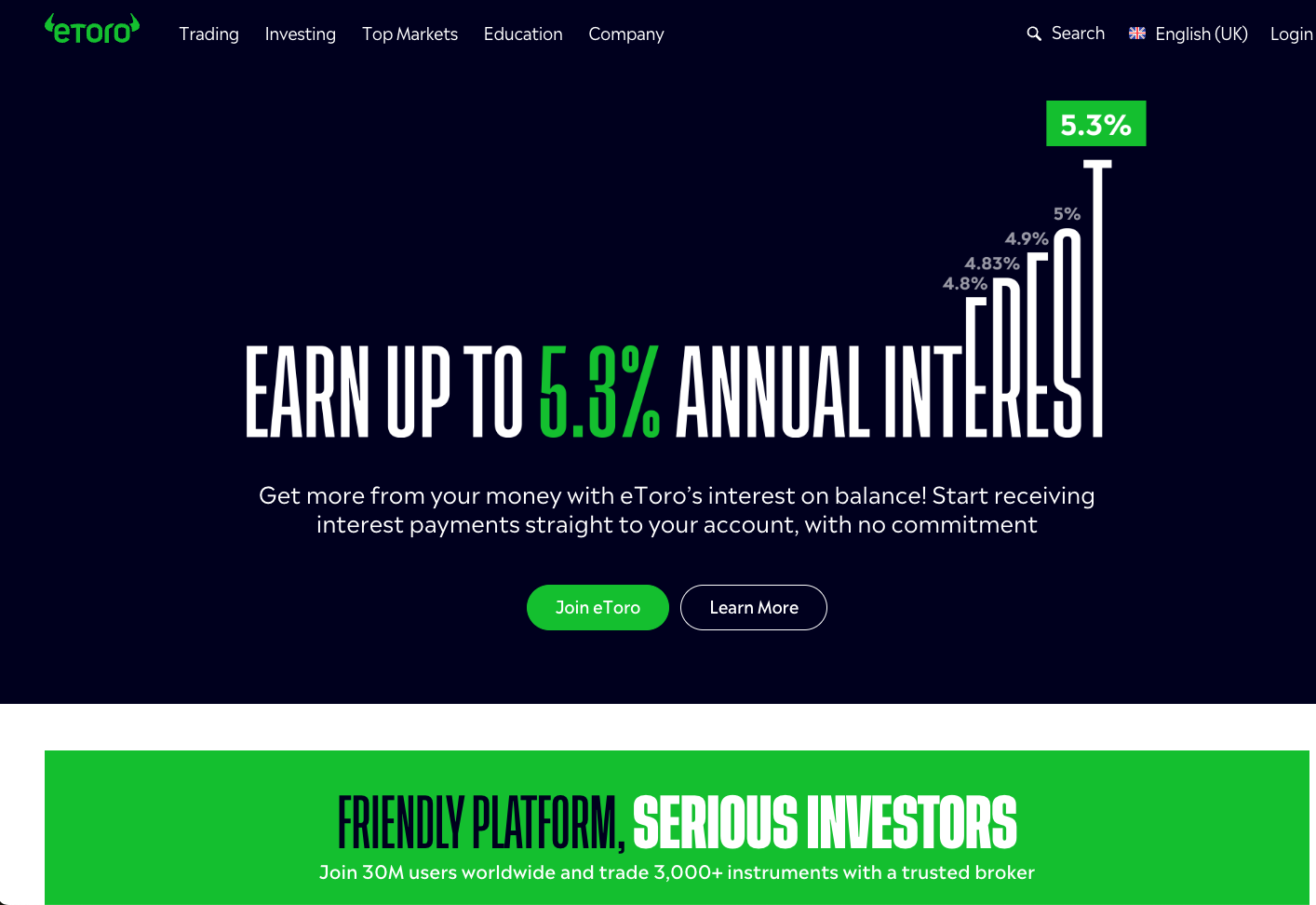
eToro's website presents a striking value proposition, leveraging a bold typographic design to highlight the potential of earning up to 5.3% annual interest. The message is clear and powerful, promising users to earn their money with minimal effort and no commitment.
The green and black color palette reinforces the brand's identity as a dynamic and growth-oriented platform, while the tagline "Friendly platform, serious investors" encapsulates their commitment to serving a diverse range of users, from casual traders to serious investors.
Why We Love It:
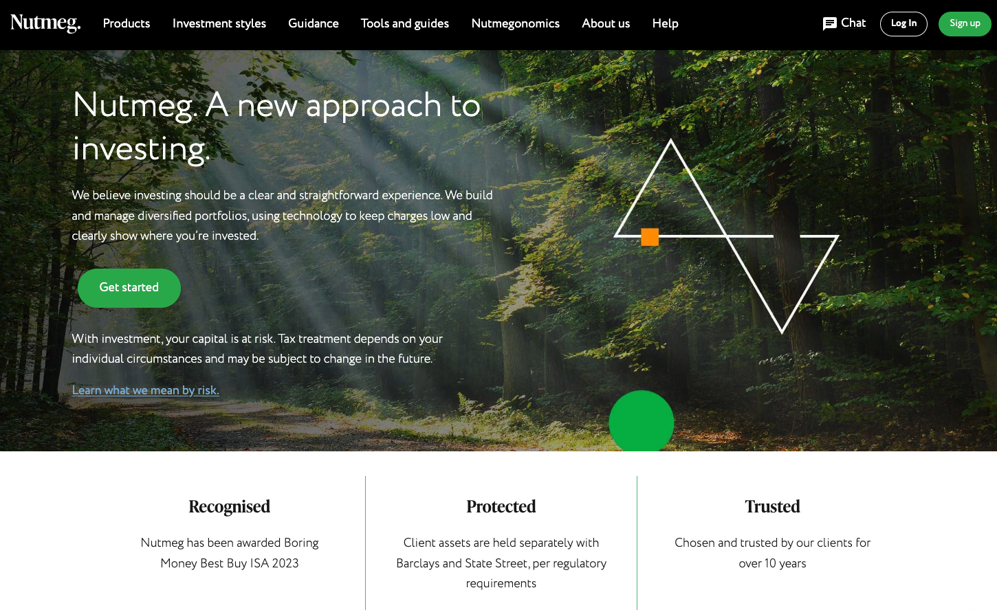
Nutmeg's website greets visitors with a serene forest backdrop, symbolizing its fresh and transparent approach to investing. Their headline "A new approach to investing" is complemented by a commitment to clarity and technology-driven solutions to manage diversified portfolios with low charges.
The design reflects a balance between tranquility and modernity, appealing to both new and experienced investors who value simplicity and transparency in financial management.
Why We Love It:
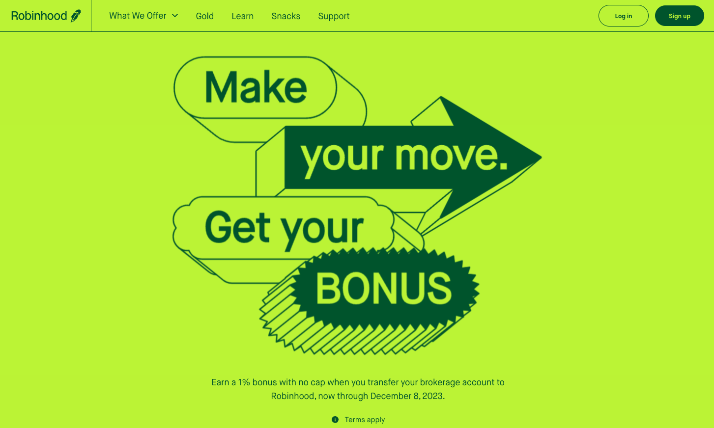
Like Mint, Robinhood is not new to the fintech world, yet continues to make waves. Robinhood's website goes straight to the point with a bold and energetic design, encouraging users to take action with the promise of a bonus. The vibrant lime green color scheme is attention-grabbing and suggests a sense of growth and prosperity, which aligns well with the company's mission to democratize finance for all.
The direct message "Make your move. Get your bonus." is a clear call to action that resonates with the platform's aim to make financial investment accessible and rewarding.
Why We Love It:
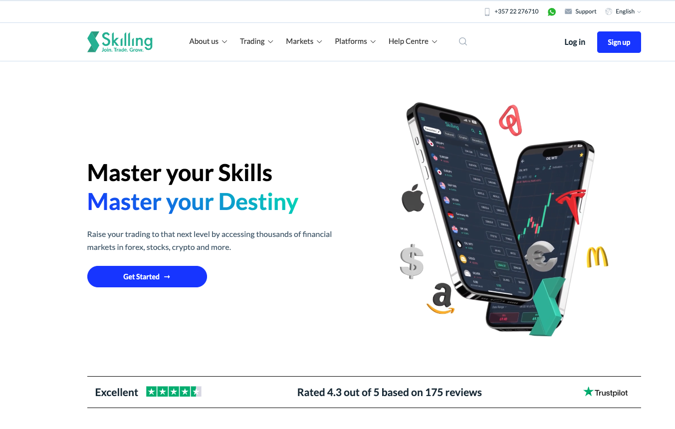
Taking a unique “educational” tone, Skilling's website offers a bold and empowering message: "Master your Skills. Master your Destiny." It's clear that they are appealing to individuals who want to take control of their financial futures through trading.
The website design is modern and dynamic, featuring crisp visuals of their trading platform on mobile devices that convey a sense of cutting-edge technology and accessibility. With a focus on forex, stocks, and crypto, Skilling positions itself as a comprehensive hub for trading education and growth.
Why We Love It:
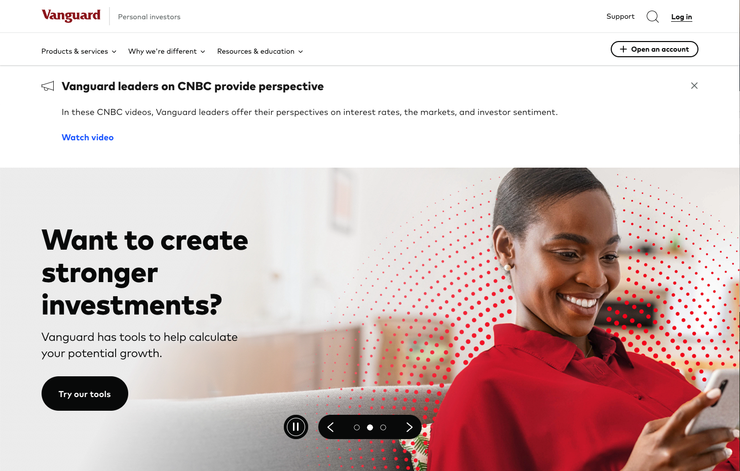
Vanguard's website presents a powerful and professional image, instilling confidence in its visitors. It's clear from the outset that the site is designed with the investor in mind, offering tools and resources to empower users to make more decisive investment choices. The prominent, bold question "Want to create stronger investments?" directly addresses the user's intent and is backed by the promise of providing the necessary tools for growth.
Why We Love It:
A growing market within fintech is insurtech, which leverages technology to streamline the process of purchasing and managing insurance. Insurance providers are using their websites as a way to stand out from competitors by creating clear and attractive user experiences.
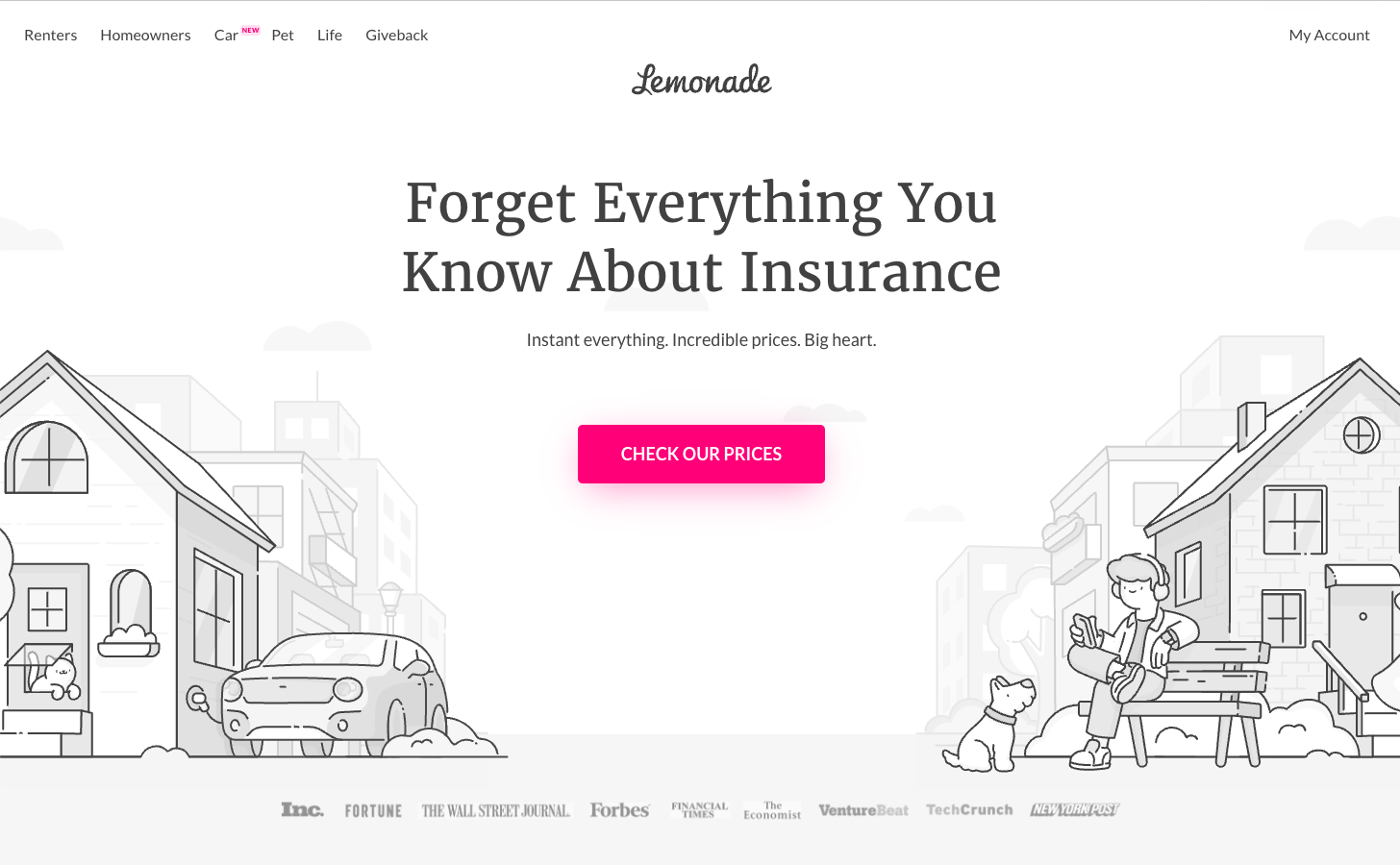
Lemonade's website embodies a fresh and modern approach to insurance, inviting users to "Forget Everything You Know About Insurance." The monochromatic illustration style paired with a pop of color from the call-to-action button creates a minimalist yet warm atmosphere. This design choice, along with the tagline "Instant everything. Incredible prices. Big heart," speaks to a company that aims to be straightforward, affordable, and socially conscious.
Why We Love It:
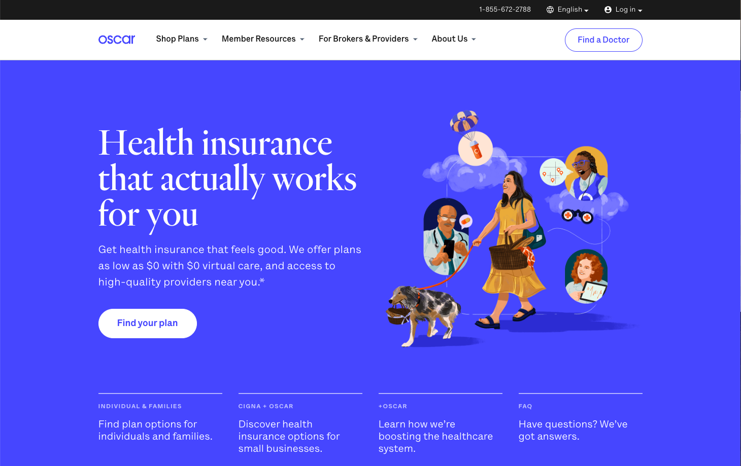
Oscar's website offers a refreshing take on health insurance, positioning it as a service that's not just necessary, but approachable and user-friendly. The site's design is vibrant and engaging, with illustrations that add a playful, human element to the often impersonal world of insurance. Its messaging is clear and relatable, promising health insurance that "actually works for you," which is a welcome departure from traditional insurance rhetoric.
Why We Love It:
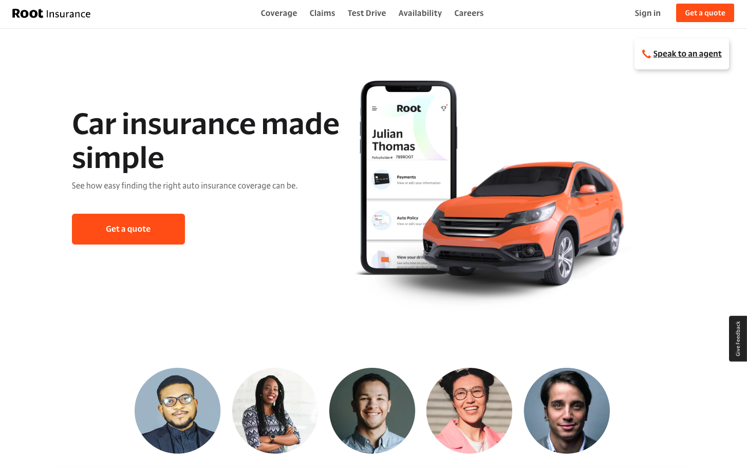
Root Insurance is an excellent example of user-centric design, offering a seamless experience that mirrors their innovative approach to car insurance. It’s easy to tell from a glance that their platform is tailored for a tech-savvy audience with a desire for simplicity and efficiency.
The homepage is a testament to this, with a bold statement that car insurance has been simplified and a visual emphasis on their mobile app, suggesting a streamlined service that is as mobile as their clientele.
Why We Love It:
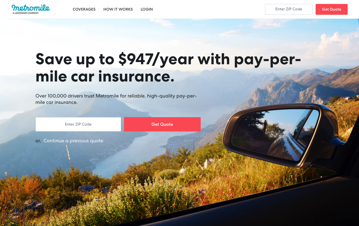
One of the more unique offerings on the market, Metromile's pay-per-mile insurance website allows you to get a quote, customize a policy, and manage your account. The website showcases a sleek, user-friendly interface that embodies the modernity and innovation of fintech in 2023.
It presents a value proposition that's both clear and enticing: significant savings on car insurance that charges by the mile, appealing directly to low-mileage drivers. The design is clean, with a bold and concise headline that draws attention, backed by a scenic visual that connotes the freedom and joy of driving.
Best Parts of Metromile's Website:
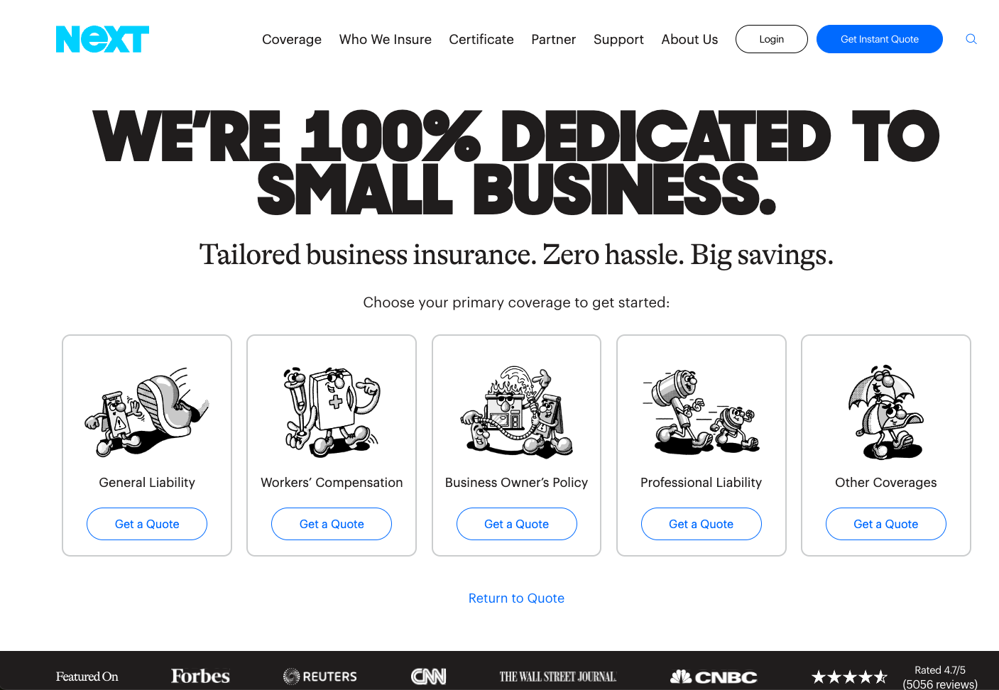
Here’s a fun one. Next Insurance built an easy-to-use site to get quotes and manage policies for small business's insurance needs. The site is simple and convenient and broadcasts its commitment to small businesses with a bold headline.
The simplicity of the message, coupled with the straightforward "Get a Quote" call-to-action buttons for various insurance types, exemplifies the company's focus on efficiency and customer ease.
Why We Love It:
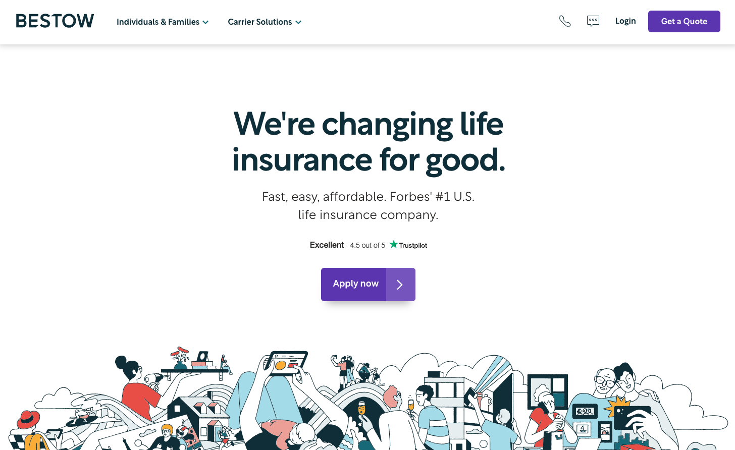
Bestow's website lets you get life insurance quotes in minutes and bind policies completely online. The website communicates its modern take on life insurance with a bold declaration: "We're changing life insurance for good."
The site blends a contemporary design with approachable, casual language to make the concept of life insurance more relatable and less intimidating. The use of clean lines, ample white space, and an illustrated graphic that includes a diverse array of individuals conveys a sense of inclusivity and simplicity in their approach to life insurance.
Why We Love It:
The best fintech websites in 2023 offer a stunning look and feel while putting precisely what the target customer needs right at their fingertips. And when you throw in a responsive structure with AI-powered features, you are sure to wow customers and make them loyal to your brand.
Use the above examples of the top fintech websites as a starting point to build your own unique digital presence. Experiences that will delight customers and keep them coming back for more. With the right design, you can create an experience that stands out from the competition and helps take your business into the future.
Our team of award-winning Fintech marketers is ready to help you exceed your revenue goals.
Here's what to expect:
We look forward to talking to you. 👋
P.S. If none of these times work for you, please send an email to team@caffeinemarketing.com
{{book-a-call="/cta"}}
