Have you been wondering why your software development landing page isn't converting qualified leads at the rate it should?
When potential clients land on your development page, you have approximately 3 seconds to establish credibility, demonstrate technical prowess, and communicate clear value—all while maintaining an experience that reflects the quality of your code. Fail in any of these dimensions, and prospects will bounce faster than a 400 error.
The brutal reality? Up to 75% of software development prospects make initial judgments about your company's capabilities based solely on your landing page experience.
The gap between average and exceptional software development landing pages has never been more financially significant.
While most firms settle for generic tech imagery and vague promises of "innovative solutions," industry leaders leverage their landing pages to demonstrate their development philosophy and technical capabilities.
Through our extensive research and experience building results-driven pages for development clients, we've curated this definitive list of the top 15 software development landing page designs that are setting new standards for the industry in 2025.
{{book-a-call="/cta"}}
Site Designed by Caffeine Marketing
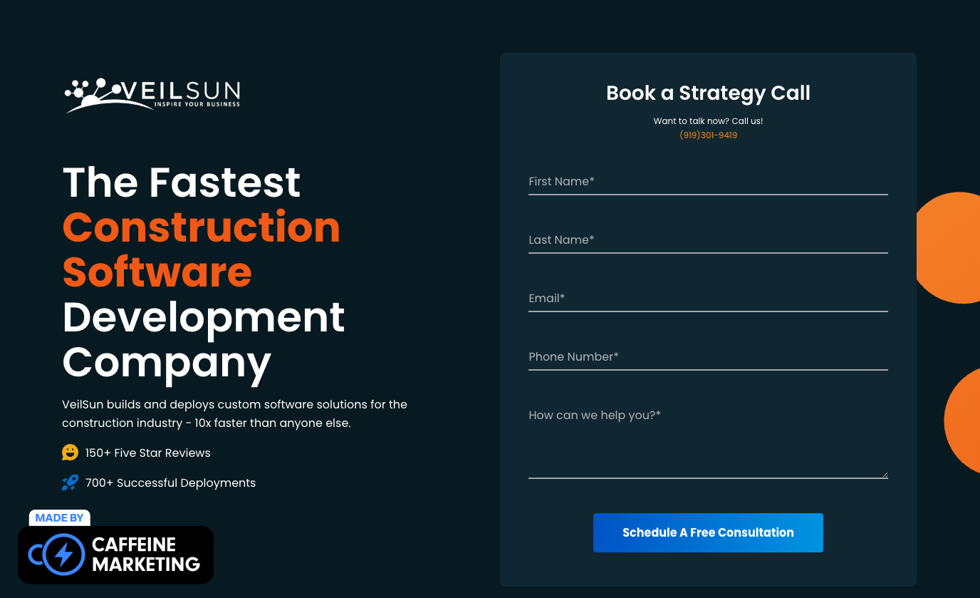
Why We Love It: VeilSun's landing page immediately demonstrates the company's technical expertise through a perfect balance of sophisticated design and clear communication – exactly what you'd want from a development partner.
Most software development landing pages fall into one of two traps: either overwhelming visitors with technical jargon that alienates non-technical stakeholders, or diluting their messaging to the point of generic meaninglessness. VeilSun elegantly sidesteps both pitfalls with a design that speaks fluently to technical and business audiences.
This landing page is particularly effective because it visually demonstrates VeilSun's development methodology through an interactive process diagram. Instead of just telling visitors about their approach, they show it through a clean, animated visualization that communicates technical sophistication without requiring a technical background.
Site Designed by Caffeine Marketing
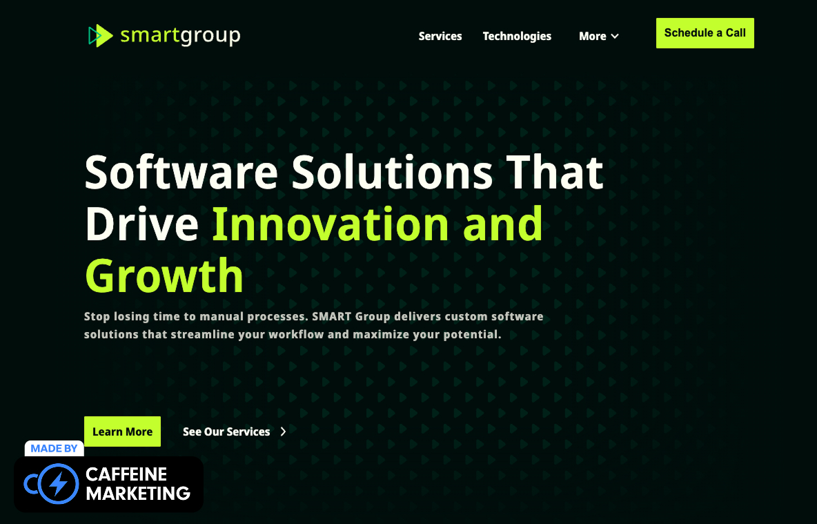
SMARTGroup's software development landing page makes an immediate impact with its bold black background and electric green accents that reflect their cutting-edge technical approach.
The page establishes immediate credibility through their "40 Hours > 10 Seconds" metric, using custom iconography that draws attention to their efficiency advantage without requiring lengthy explanation.
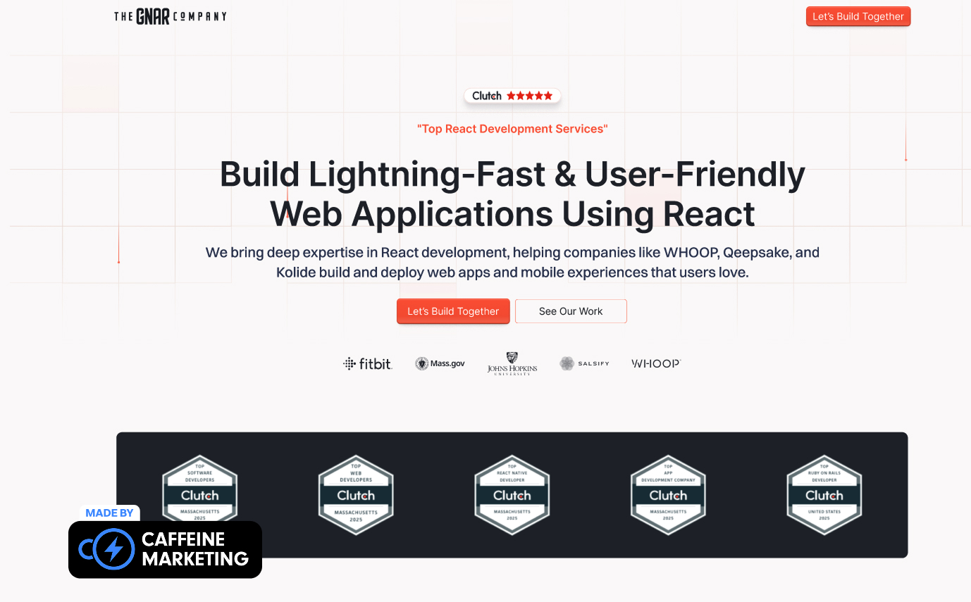
The Gnar's development landing page breaks industry conventions with a vibrant, personality-filled design that immediately communicates their unique approach to software development.
Their conversational headline "We build custom software that humans love to use" establishes both technical credibility and user-centric philosophy in a single sentence, while their project showcase features actual application interfaces rather than generic mockups.

Vercel's landing page opens with the powerful promise to be your complete web platform. It immediately establishes their outcome-focused approach. The page brilliantly segments visitors by use-case through tidy navigation cards that shorten the buyer journey, while immediately displaying customer logos for instant credibility.

Linear's landing page exemplifies minimalist power through spare design paired with conversational headline copy and subtle motion that shows their tool in action. Their copy reads like a Slack message—human and fast—creating immediate connection with development teams, while repeating CTAs keep decision friction remarkably low.

Supabase's landing page makes a bold claim with "Build in a weekend. Scale to millions," immediately staking out a powerful transformation promise while reassuring budget-minded engineers with their OSS badge. The asymmetrical headline creates visual interest while clearly communicating their value proposition of speed combined with scalability.

Replit's landing page creates immediate engagement by dropping an AI coding demo right in the hero section, allowing prospects to experience value before signup. This embedded playground creates an instant "aha moment" for technical visitors, while their "Loved by 40 million" statistic establishes overwhelming social proof without cluttering the design.

Netlify centers their landing page around the compelling promise to "Push your ideas to the web," positioned directly above logos ranging from Nike to Riot Games that position them as the default deployment choice. Their three-column "Build / Deploy / Run" structure perfectly mirrors development workflow, creating immediate understanding of their value proposition.

GitHub Copilot's landing page frames AI as a teammate with the humanizing headline "AI that builds with you," then demonstrates this promise through scrolling code snippets that auto-complete in real time. This interactive preview provides immediate proof of value while Fortune-500 logo placement establishes instant credibility with enterprise visitors.

Sentry's landing page stands out with self-deprecating humor—"considered not bad by 4 million developers"—making their brand instantly memorable while lowering buyer guard in a typically serious category. Their sticky twin CTAs efficiently capture both trial and sandbox visitors, while their usage statistic anchors their market authority.

Postman's landing page boldly labels their offering "The Complete API Platform" while displaying a live user counter exceeding 35 million to create powerful FOMO. Their animated counter signals strong community momentum, while their sectioned workflow presentation (Design → Test → Ship) provides immediate clarity on their value proposition.

Toptal's landing page leads with their famous "Top 3% of Freelance Talent" claim—an unapologetically bold position paired with rotating expert cards that add human warmth to their marketplace. The numeric superlative is both sticky and specific, while headshots humanize what could otherwise feel like an impersonal talent marketplace.

X-Team's landing page opens with a rally-cry headline—"Accelerate Your Growth with Elite Tech Talent"—backed by impressive retention-rate and NPS numbers that communicate reliability. The benefit is smartly framed around growth rather than merely staffing, while animated metrics provide compelling data points that support their claims.

Brainhub's landing page features an oddly precise promise—"Top 1.36% talent"—that immediately stands out in a sea of rounded claims. Their "Get a proposal" CTA remains visible without scrolling, capturing high-intent leads efficiently, while supporting testimonials emphasize their painless augmentation process to address common outsourcing concerns.

Itransition's landing page leans on their impressive longevity—"25+ years"—while featuring a mega-menu of services that doubles as an SEO hub yet keeps their hero section refreshingly uncluttered. Their tenure anchor provides immediate reassurance to enterprise buyers, while their secondary navigation prioritizes case studies for proof of capabilities.
The best software development landing pages establish technical authority without drowning visitors in jargon:
This balanced approach ensures CTOs see the technical excellence they require while business stakeholders understand the practical implications without feeling alienated.
Generic claims about "innovative solutions" or "cutting-edge technology" fail to connect with today's savvy buyers. The most effective development landing pages in 2025 prioritize concrete business outcomes.
By focusing on business results rather than technical processes, landing pages create immediate relevance that purely technical messaging simply cannot achieve.
The most compelling software development landing pages don't just talk about their capabilities – they demonstrate them through their own implementation:
Software development involves significant investment and risk. The best landing pages address these concerns through strategic trust signals:
These trust elements address the fundamental question every visitor has: "Can I trust you with my critical development needs?"
Software development decisions rarely happen in a single visit. The most successful landing pages offer multiple conversion paths that align with different stages in the development of the buying journey.
Each conversion opportunity should provide genuine value while advancing the relationship, creating a win-win exchange rather than a premature sales push.
Slow-loading pages with performance issues send an immediate subconscious signal: if you can't optimize your own digital assets properly, why should visitors trust you with theirs? The best software development landing pages demonstrate technical competence.
These technical elements might seem invisible to average visitors, but they communicate volumes to development-savvy prospects who often evaluate these details before engaging.
Your landing page isn't just a digital business card. It's often the first and potentially last opportunity to demonstrate your development philosophy and technical capabilities to prospective clients.
At Caffeine Marketing, we've helped numerous software development companies transform their landing pages from generic tech brochures into powerful lead-generating assets. Our approach combines technical expertise with conversion-focused design to create landing pages that don't just look impressive – they drive measurable business results.
Ready to see how your software development landing page stacks up against these industry leaders? Book a free 30-minute consultation with our team today. We'll analyze your current landing page performance and identify specific opportunities to increase your conversion rates and lead quality.
Schedule Your Free Consultation Now
Every effective software development landing page should include visual demonstrations of technical capabilities, business outcome-focused messaging rather than technical specifications, clear development methodology explanation, proof elements like case studies or code samples, multiple conversion paths for different decision stages, and flawless technical implementation that subtly demonstrates your quality standards.
Design isn't just about aesthetics in software development—it's a functional demonstration of your attention to detail and user experience philosophy. Our testing shows that thoughtfully designed interfaces with clear information hierarchy, appropriate white space, and subtle interactive elements can increase visitor trust by up to 48% and improve conversion rates by as much as 32% compared to generic templates.
The most effective approach is a balanced "capability-outcome framework" that connects each technical capability to a specific business benefit. Begin by briefly establishing technical credibility to pass the initial expertise filter, then immediately translate that capability into business language that addresses stakeholder concerns. This dual-language approach satisfies both technical evaluators and business decision-makers without alienating either group.
The most compelling demonstrations combine interactive elements that showcase actual functionality, visual representations of development processes, carefully selected code snippets that demonstrate coding standards, performance metrics from previous projects, and subtle technical excellence in the page's own implementation (load speed, responsiveness, clean console output) that technical visitors will notice and appreciate.
The highest-converting software development landing pages offer multiple CTAs tailored to different stages in the buying journey—from low-commitment options like code sample downloads and development guides for early-stage research, to discovery workshop bookings and estimate requests for decision-ready visitors. Each CTA should provide genuine value while advancing the relationship, recognizing that development decisions typically involve multiple stakeholders and extended consideration periods.
